
30 ChatGPT Images 2.0 prompts you can actually use at work
Storyboards, infographics, floor plans, mock-ups and branding. Thirty prompts ready to paste, ten advanced ones built on technique names, and a template for everything the list does not cover.
A prompt for ChatGPT Images 2.0 works when it has five parts: type, purpose, composition, style and constraints. We tested thirty prompts built that way on Nano Banana Pro in August 2026. Twenty-five landed first time and five needed rewriting. All thirty are below, written in English and ready to paste, with square brackets marking the only parts you swap for your own.
Key facts
- 25 of 30 prompts landed first time (83 percent). Our own test, Nano Banana Pro model, August 2026.
- Floor plans and UX mock-ups landed in full, storyboards did worst at 2 of 4. Hard geometry beats a plot description.
- Colours always as hex values, never by name. With hex values the palette matched in 30 cases out of 30.
- Text on an image tops out at about 25 characters per block. Beyond that, the letters start to fall apart.
- Compression is not optional: 75.7 MB of raw PNG came down to 1.28 MB after conversion to WebP.
Why do image generation prompts fail?
Because they describe how the picture should look instead of how it is laid out. Give the model "a nice storyboard" and it has to guess the number of panels, the grid and the reading order on its own. Its guesses are average. In our August 2026 test, thirty prompts that spelled out the layout landed first time in twenty-five cases. The other five needed rewriting.
The first time we ran Images 2.0 it was 23:40, and a storyboard was due the next morning. The prompt was "coffee ad storyboard, nice, modern". Back came eight panels of the same person drinking something brown in eight almost identical poses.
We tried again, adding "professional", then "cinematic", then "agency-quality". Same result every time, just under a different filter.
The problem was not the model. We had written a wish instead of a brief.
Tell a designer to "make something nice" and you will also get eight identical panels back. Or ten questions before they touch a pencil. The model will not ask. It will guess.
What goes into a prompt that works?
Five parts: type, purpose, composition, style and constraints. Cut one and the model improvises exactly there. Order matters too, because the start of a prompt carries more weight than the end. That is why the type goes first and the constraints go last, where they act as a filter on an idea that is already formed.
- 1. Type and subject. Name the format, not the mood. The model knows the word "storyboard" and knows it means a grid of panels. It does not know what "nice" means.Instead of: a nice coffee graphic
Write:an 8-panel storyboard grid for a 30-second coffee ad - 2. Purpose. Say what the image has to do to the viewer. The model uses the purpose to set the hierarchy, so without it everything carries the same weight.Instead of: make it interesting
Write:purpose: the image must explain the process to a first-time buyer - 3. Composition. Aspect ratio, grid, number of elements, reading direction. The only part that genuinely rescues a layout.Instead of: well laid out
Write:16:9, three stacked bands, reading top to bottom, band 2 dominates - 4. Style. Name a specific aesthetic and give the colours as hex values. The model interprets colour names loosely; hex values it does not.Instead of: modern, orange accent
Write:Swiss-influenced flat design, palette #0B0617 #F5F6F8 #FF7F11 - 5. Constraints. List what must not appear. This does more than a style description, because by default the model drifts towards the average.Instead of: nothing weird
Write:no stock photography, no gradients, max 6 words per panel

It is the same logic we apply when writing content for AI citation: the specific thing first, context after. Why that ordering matters to retrieval systems is covered in our piece on passage ranking.
How many attempts does a prompt need?
With this structure, usually one. We ran all thirty prompts from this article through the Nano Banana Pro model in August 2026 and checked how many produced an image matching the brief at the first attempt. The result: twenty-five out of thirty, or 83 percent. Five needed the prompt rewriting.
A note on models, since the title names ChatGPT Images 2.0: the prompts are written for it, but this test was run on Nano Banana Pro (gemini-3-pro-image), and every prompt output shown on this page was generated with it. The hit rate describes how the prompts performed on that model. It is not a benchmark of ChatGPT Images 2.0.
We found no study that measures this. The first page of results for "AI image generation statistics" was made up entirely of sites repeating the same figures without linking to a source, so we counted ourselves.
| Category | Prompts | First-attempt hits |
|---|---|---|
| Storyboards and video | 4 | 2 of 4 |
| Infographics and diagrams | 7 | 5 of 7 |
| Floor plans and spatial plans | 6 | 6 of 6 |
| Product and UX | 4 | 4 of 4 |
| Educational materials | 3 | 3 of 3 |
| Branding and packaging | 3 | 2 of 3 |
| Editorial and photography | 3 | 3 of 3 |
| Total | 30 | 25 of 30 (83%) |
The pattern is clear. Floor plans, site plans and UX mock-ups landed in full, because there the prompt gives hard geometry: the number of columns, the isometric angle, the aspect ratio. Storyboards were where it slipped, in the prompts that described a narrative arc instead of a panel grid. The fix was to stop describing the plot and state outright how many panels there are, in what grid, and what sits in each one.
For a sense of how widespread these tools already are: in Adobe's Creators' Toolkit Report from October 2025, based on a sample of more than 16,000 creators in eight countries, 86 percent said they use generative AI in their workflow. One caveat, because the figure is often misquoted: Adobe surveyed emerging and semi-professional creators publishing on social media, not full-time creative professionals. It is not a figure about designers.
Thirty prompts: which one for which job?
Seven categories, from storyboards to photo shoot plans. Paste the prompts as they are: the square brackets are the only places to swap in your own content. Accent and brand colours are always given as hex values rather than names, and that is deliberate. The section on common mistakes explains why.
Storyboards and video (4 prompts)
For when you need to show a sequence rather than a single frame. The key: force a grid and panel numbering, otherwise you get one large image.
01Storyboard for a 30-second ad
For pitching an idea to a client before anyone books a camera. Eight panels is the standard for thirty seconds.
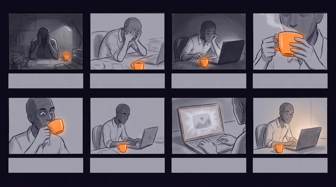
A professional 8-panel storyboard grid for a 30-second [product category] commercial, landscape 16:9, panels numbered 1 to 8 in a 4x2 layout with thin dividing lines.

Narrative arc across the panels: [beat 1: the problem], [beat 2: discovery], [beat 3: the turn], [beat 4: the payoff].

Each panel is a clean pencil-and-marker sketch with a visible camera direction label underneath, such as WIDE, CLOSE UP, OVER SHOULDER, TRACKING.

Muted greyscale linework with a single accent colour [#FF7F11] used only on the product.

Constraints: no photographic rendering, no text inside the panels other than the camera labels, no faces in extreme detail, keep each panel readable at thumbnail size.02Storyboard for an explainer animation
When you are explaining a process rather than selling a product. Six panels are enough for one concept.
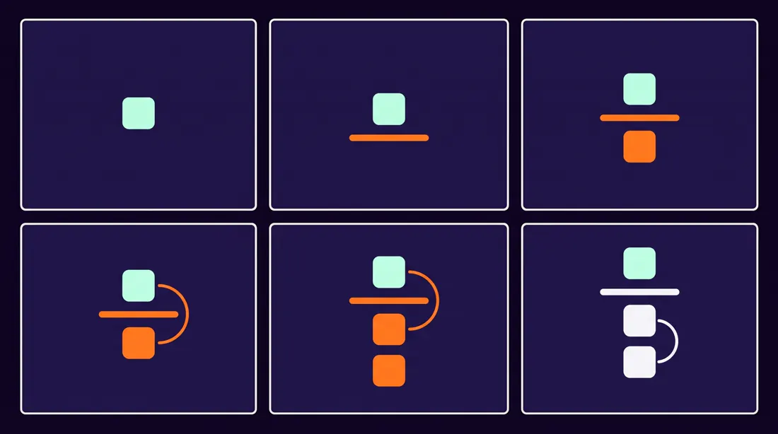
A 6-panel storyboard for a short explainer animation about [concept], landscape 16:9, arranged in a 3x2 grid with generous white space between panels.

The sequence teaches one idea: [what the viewer should understand by the end]. Panel 1 poses the question, panels 2 to 5 build the explanation one layer at a time, panel 6 states the conclusion visually.

Flat vector illustration style, rounded geometric shapes, friendly and non-corporate. Palette limited to [#20113B], [#FF7F11] and off-white [#F5F6F8].

Constraints: no gradients, no drop shadows, no more than three shapes per panel, no written sentences, only simple icons and arrows.03Instructional comic
Instructions that someone will actually read. Works well in onboarding and in health-and-safety material.
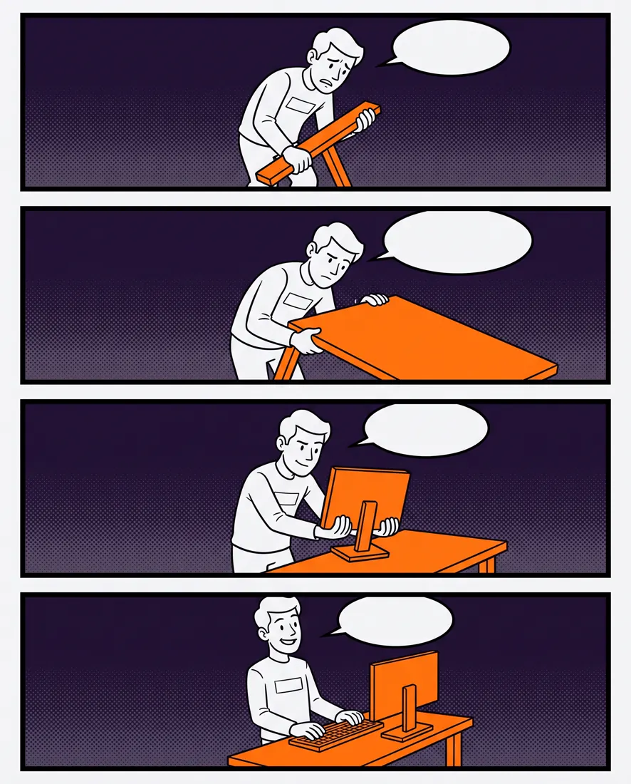
A 4-panel instructional comic strip showing how to [complete the task], portrait 4:5, panels stacked vertically with clear black borders.

A single recurring character performs the steps in order. Their expression shifts from uncertain in panel 1 to confident in panel 4. Each panel isolates exactly one action so the reader cannot merge two steps.

Clean line-art comic style, bold outlines, flat fills, halftone texture in the backgrounds only. Accent colour [#FF7F11] marks the object being acted on in every panel.

Constraints: empty speech bubbles that I will fill later, no captions, no hands rendered in more than four fingers, consistent character design across all panels.04Shot plan for a vertical short video
Reels, TikTok, Shorts. A vertical grid makes you think in a 9:16 frame from the start instead of cropping a landscape shot at the end.
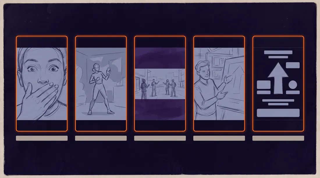
A shot-planning sheet for a 15-second vertical social video about [topic], landscape 16:9 canvas containing five 9:16 phone-shaped frames in a single row.

Frame 1 is the hook, frames 2 to 4 carry the content beat by beat, frame 5 is the call to action. Under each frame sits a thin label strip showing the shot type and its duration in seconds.

Minimal editorial sketch style on a dark background [#0B0617], frames outlined in [#FF7F11], interior sketches in light grey [#9B9DB9].

Constraints: keep all sketch content inside the safe area away from the top and bottom 12 percent of each frame, no platform logos, no readable body text.
Infographics and diagrams (7 prompts)
The hardest category, because it needs text, and text is the weakest point of every generator. Keep labels under twenty-five characters and do not try to squeeze in sentences.
05Problem-and-solution infographic
The most versatile sales format. Three stacked sections read on a phone without zooming.
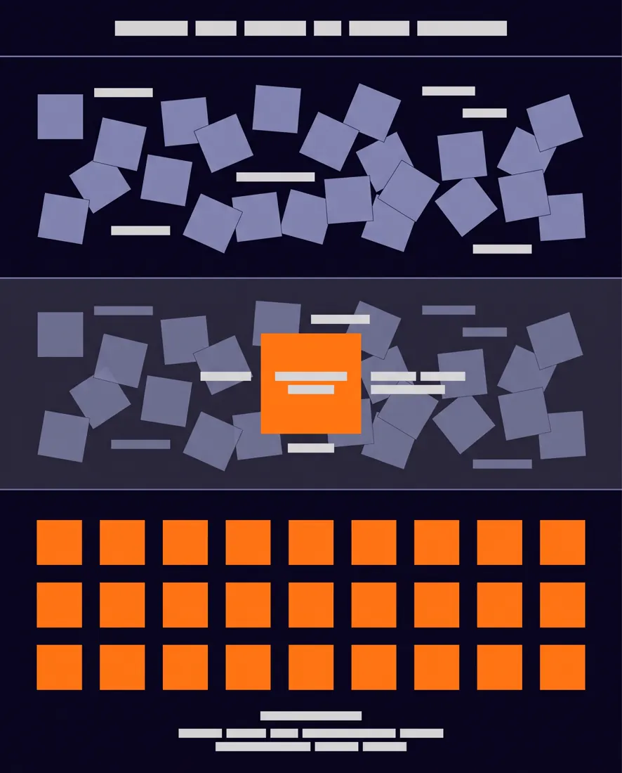
A vertical 4:5 infographic titled "[max 25 characters]", built as three stacked horizontal bands separated by hairline rules.

Band 1 shows the problem as a cluster of tangled, chaotic elements. Band 2 shows the cause as a single highlighted node inside that cluster. Band 3 shows the resolution as the same elements arranged into a clean grid.

The visual argument must be readable without any text: chaos becomes order from top to bottom.

Modern flat design on a deep background [#0B0617], structural elements in [#9B9DB9], the highlighted cause and the resolution in [#FF7F11].

Constraints: only the title carries text, every other label is a short 2-word tag, no stock icons, no photographs, no rainbow gradients.06Comparison infographic
For A-versus-B comparisons. Left-to-right symmetry is the one thing that has to be right.
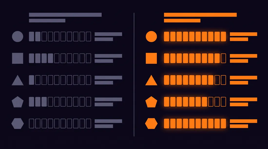
A side-by-side comparison infographic contrasting [option A] with [option B], landscape 16:9, split down the middle by a vertical divider.

Both halves use an identical row structure so the eye can scan across: five comparison rows, each represented by a simple icon on the left column and a filled progress indicator on the right.

The left half is rendered in muted grey [#5E5D76] and the right half in the accent [#FF7F11], making the recommended option obvious without stating it.

Clean Swiss-influenced layout, generous margins, strong typographic hierarchy.

Constraints: labels no longer than 3 words, no checkmark or cross symbols, no faces, keep the divider perfectly centred.07Timeline
Company history, a roadmap, project stages. Horizontal for up to six stages, vertical beyond that.
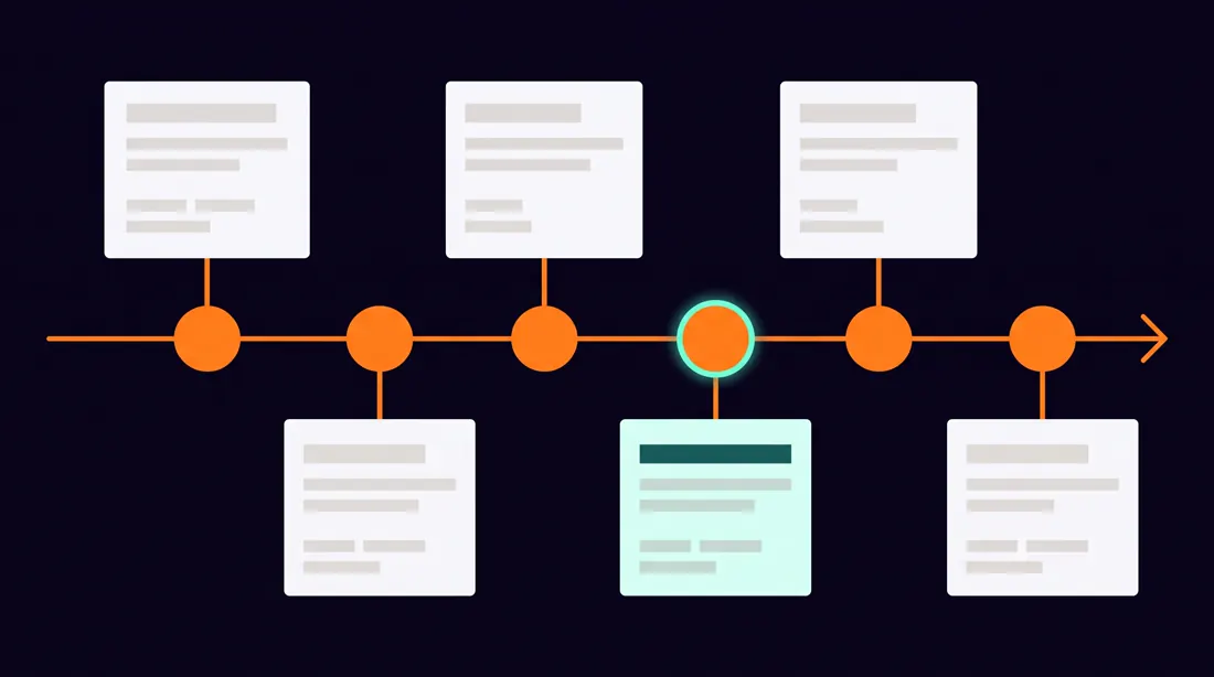
A horizontal timeline infographic covering [period or process], landscape 16:9, with a single continuous spine running left to right across the middle of the canvas.

Six milestone nodes sit on the spine at uneven intervals reflecting real time gaps, not decorative spacing. Each node alternates its label block above and below the spine to avoid collisions.

Each milestone carries a year in monospace type and one short descriptor beneath it.

Editorial data-visualisation style on [#0B0617], spine and nodes in [#FF7F11], labels in [#F5F6F8], secondary text in [#9B9DB9].

Constraints: descriptors under 20 characters, no arrows other than the spine itself, no decorative illustrations, equal node sizes.08Mind map
For brainstorming and for structuring a topic before writing. Keep it to three levels, beyond that it becomes unreadable.
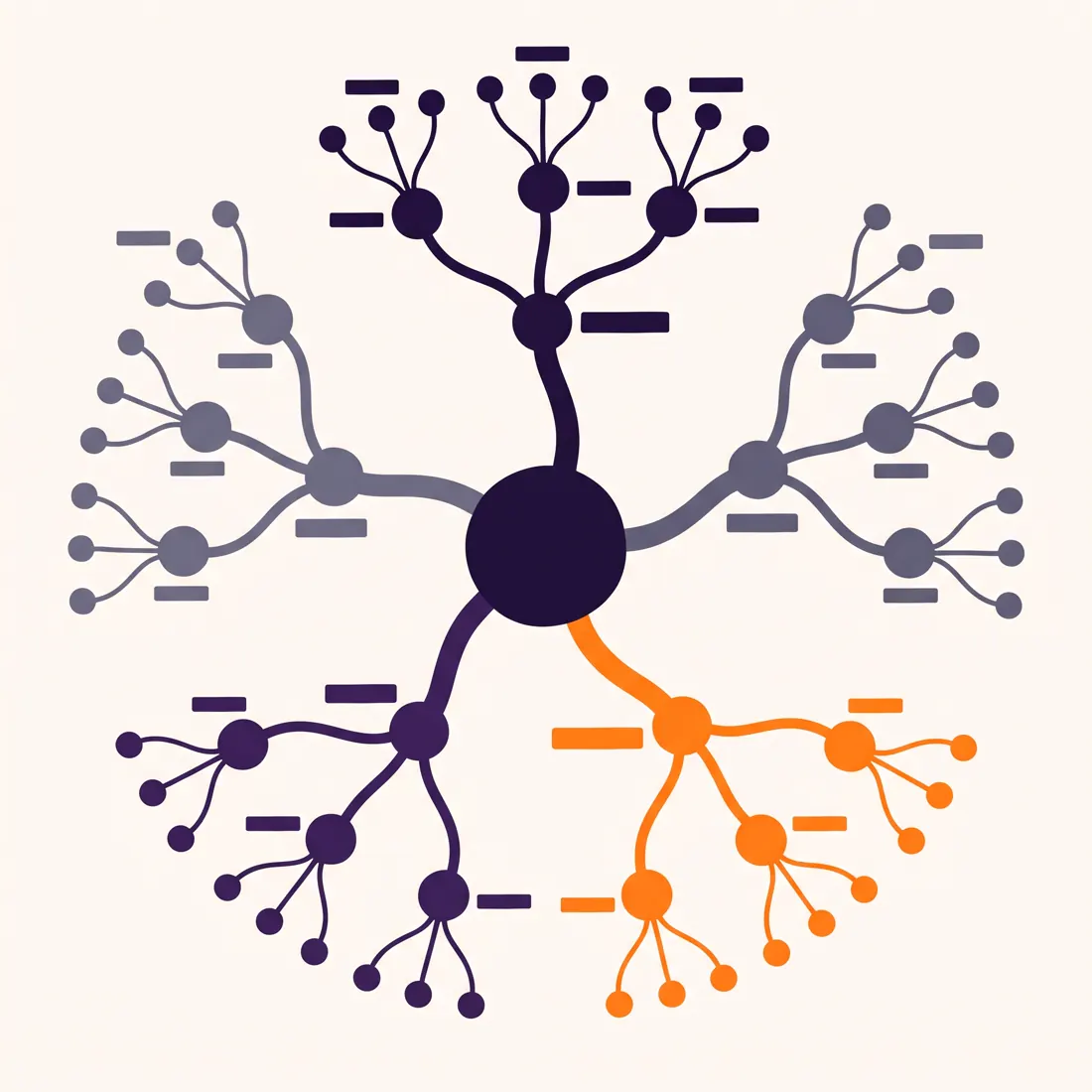
A radial mind map centred on the concept [central topic], square 1:1, with the core node placed dead centre.

Five primary branches radiate outward at even angles. Each primary branch splits into exactly three secondary nodes. Branch thickness decreases with each level so hierarchy is visible at a glance.

Node labels are short tags, never sentences. The central node is visually heaviest.

Hand-drawn-meets-digital style, smooth curved connectors rather than straight lines, on off-white [#F5F6F8] with branches cycling through [#20113B], [#7D7DA1] and [#FF7F11].

Constraints: exactly three levels of depth, no crossing connectors, labels under 18 characters, no icons inside nodes.09Customer journey map
A workshop with the sales team or a funnel audit. The emotion curve underneath is what sets it apart from a plain timeline.
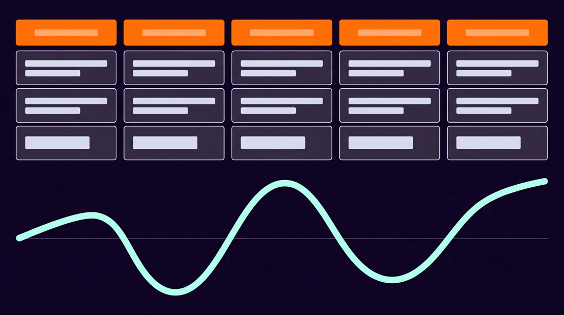
A customer journey map for [persona] buying [product or service], landscape 16:9, structured as five vertical stage columns: Awareness, Consideration, Decision, Onboarding, Retention.

Each column contains three stacked rows: the customer action at the top, the touchpoint in the middle, and the internal owner at the bottom.

Below the columns runs a continuous emotion curve that dips at the friction points and rises at the wins, drawn as a smooth line.

Clean consulting-deck aesthetic on [#0B0617], column headers in [#FF7F11], the emotion curve in [#C5FEEC], body cells in [#DDE0E8].

Constraints: cell text limited to 3 words, no photographs, no avatar illustrations, the emotion curve must visibly cross below the baseline at least once.10Service mechanism diagram
How it works in three steps, told only with a drawing. For service pages and decks.
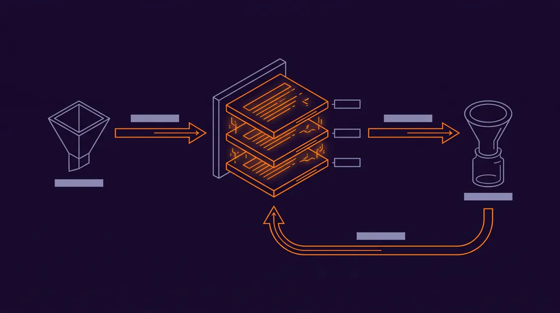
A service mechanism diagram explaining how [service] works, landscape 16:9, drawn as a left-to-right flow with three primary stages connected by directional arrows.

Stage 1 shows the input, stage 2 shows the processing layer rendered as a stack of three thin horizontal plates, stage 3 shows the output. A feedback loop arrow returns from stage 3 to stage 2 along a curved path underneath.

Isometric technical illustration, thin consistent line weights, subtle depth without heavy shading.

Deep background [#150826], structure lines in [#9B9DB9], the active processing layer and all arrows in [#FF7F11].

Constraints: no server or cloud clichés, no human figures, stage labels under 15 characters, arrow direction must be unambiguous.11Educational chart with a diagram
For training and internal materials. The format of a classic classroom wall chart, without the 1980s look.
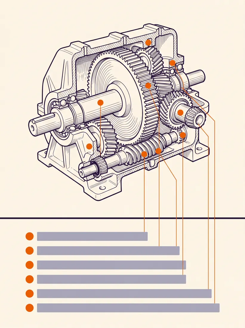
An educational wall chart explaining [subject], portrait 3:4, with a single large cutaway diagram occupying the upper two thirds and a labelled legend strip across the bottom third.

The main diagram is annotated with six thin leader lines pointing to numbered parts. The legend maps each number to a short name.

Scientific illustration style with precise linework and restrained cross-hatching, printed on warm off-white [#F2F2FF], ink in [#20113B], numbered callouts in [#F06206].

Constraints: leader lines must not cross each other, legend entries under 20 characters, no decorative borders, no gradient fills.
Floor plans and spatial plans (6 prompts)
This is where the model surprises most. There is one condition: state explicitly that it is a top-down view, because by default the model pulls towards perspective.
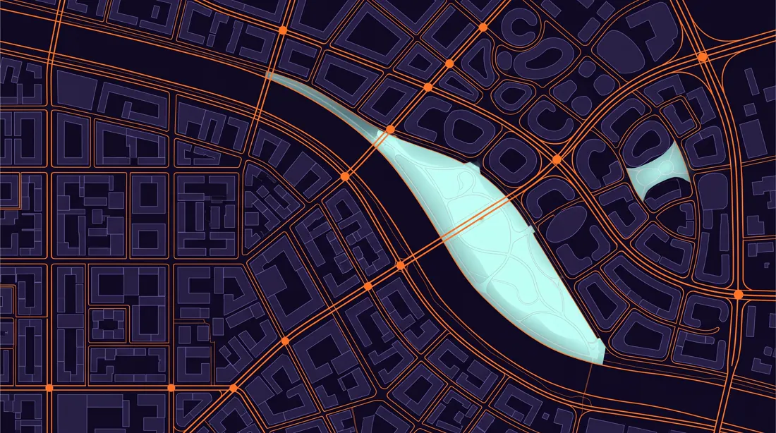
12Plan of a city of the future
For vision presentations, report covers and backgrounds behind a headline. Striking and surprisingly cheap to produce.
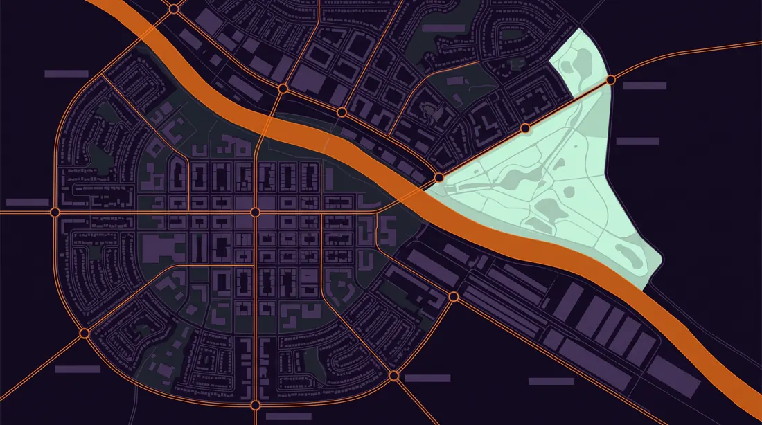
A detailed top-down city plan of a fictional sustainable metropolis called [city name], landscape 16:9, viewed as a flat orthographic map with no perspective distortion.

The city is organised around a river running diagonally across the canvas. Distinct districts are legible by their block geometry: a dense grid core, an organic residential ring, a linear industrial strip along the water, and a wedge of parkland.

Transit lines cross the map as clean coloured strokes with circular interchange markers.

Architectural site-plan aesthetic, thin precise linework, flat fills, no buildings rendered in 3D.

Base in [#0B0617], built form in [#2C1850], parkland in [#C5FEEC], transit and the river edge in [#FF7F11].

Constraints: strictly overhead view, no street names, no compass rose, no lens flare, keep the river continuous from edge to edge.13Housing development site plan
Property development and investment visualisations. A smaller scale than a city, so more detail per unit of area.
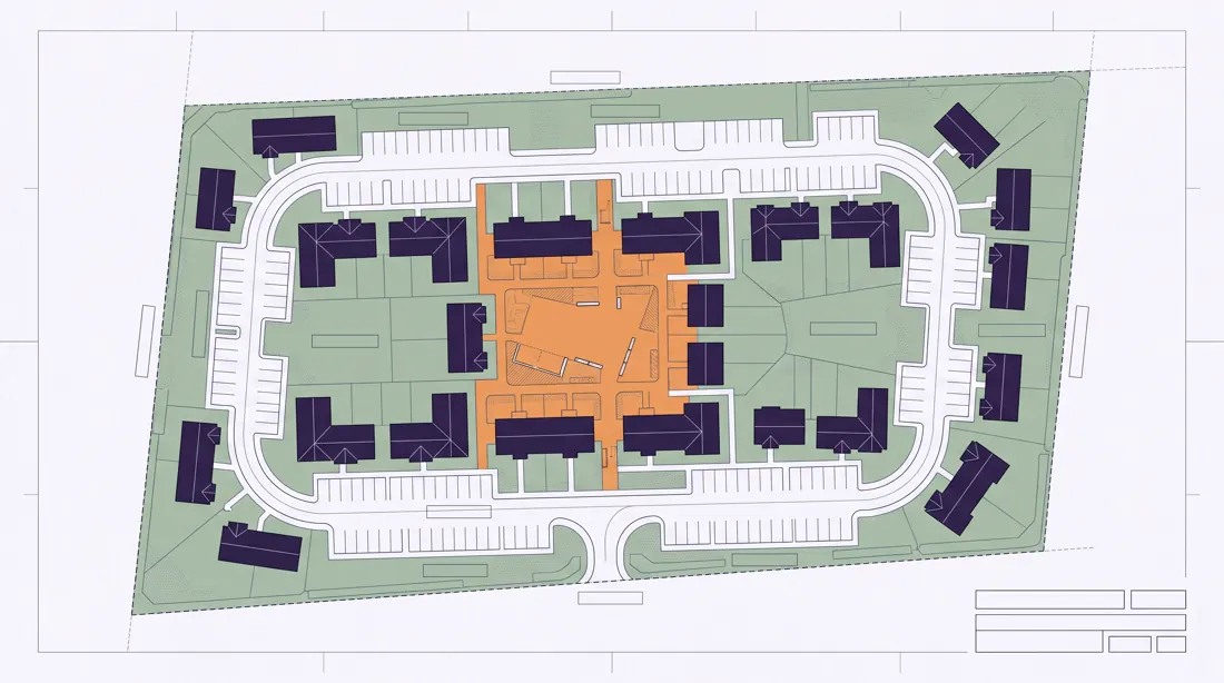
A residential development site plan for [number] housing units, landscape 16:9, drawn as a flat overhead architectural plan.

Buildings are shown as simple footprint shapes with roof lines indicated. A single access road loops through the site with parking bays along its edge. Green space occupies at least one third of the plot, including a central shared courtyard.

Individual plot boundaries are drawn as thin dashed lines.

Professional architectural drawing style, consistent 1 to 500 scale feel, minimal fills.

Paper background [#F5F6F8], linework in [#4F5060], building footprints in [#20113B], landscaping in soft green, the courtyard highlighted in [#FF7F11].

Constraints: overhead only, no trees rendered individually, no cars, no text labels, keep roads continuous and connected.14Isometric venue plan
Café, office, showroom. An isometric view reads better than a flat plan when you show it to a client rather than a contractor.
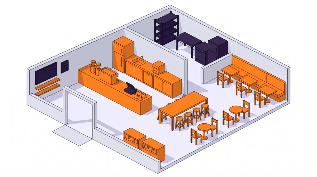
An isometric cutaway floor plan of a [venue type] interior, landscape 16:9, drawn at a true 30-degree isometric angle with the front wall removed.

The layout reads clearly: entrance zone, service counter, seating area with mixed table sizes, and a back-of-house strip. Furniture is simplified but proportionally correct. Wall height is low enough to see the whole floor.

Clean isometric vector illustration, flat colour with a single soft shadow per object, no texture.

Floor in warm [#F2F2FF], walls in [#DDE0E8], furniture in [#20113B], the service counter and all seating in [#FF7F11].

Constraints: strict isometric projection with no vanishing point, no people, no plants larger than the furniture, all objects aligned to the same grid.15Apartment floor plan
Property listings and sales material. The model handles this better than anything else in this category.
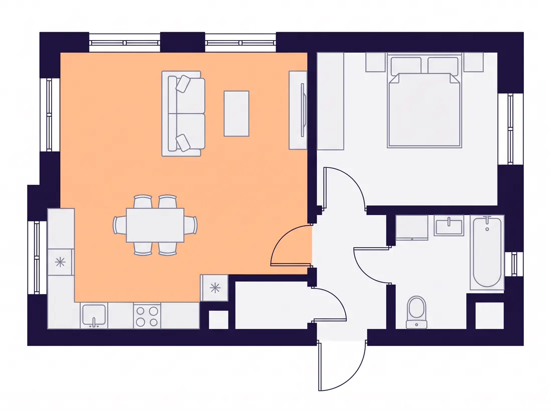
A clean 2D floor plan of a [number]-room apartment of approximately [area] square metres, landscape 4:3, viewed strictly from above.

Rooms are separated by walls drawn as solid dark bands of consistent thickness. Door swings are shown as quarter-circle arcs. Windows appear as breaks in the wall with a thin double line.

Each room contains minimal furniture indicating its function: bed, sofa, dining table, kitchen counter, bathroom fixtures.

Modern real-estate floor plan style, flat and legible, no shadows.

Walls in [#20113B], floor fills in very light [#F5F6F8], furniture outlines in [#9B9DB9], the living area floor tinted [#FF7F11] at 10 percent opacity.

Constraints: absolutely no perspective, no room labels, no dimension strings, walls must fully enclose every room with no gaps except doors.16Evacuation map
Note: this is an illustrative mock-up, not a document that complies with any standard. Fine for a mock-up or a presentation, not for hanging on a wall.
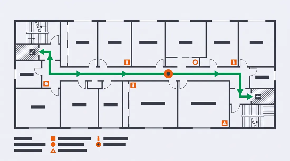
An emergency evacuation plan for a single floor of an office building, landscape 16:9, drawn as a flat overhead plan.

The floor layout shows corridors, rooms and two stairwells at opposite ends. A bold continuous escape route traces from the centre of the floor to both exits. Assembly point and fire equipment positions are marked with simple geometric symbols.

A YOU ARE HERE marker sits at one clearly defined position.

Standard safety-signage visual language, high contrast, flat fills, no decoration.

Background in [#F5F6F8], walls in [#31343A], escape routes in vivid green, equipment markers in [#DB0819].

Constraints: overhead only, symbols must be geometric and unambiguous, no text beyond the single YOU ARE HERE label, routes must never dead-end.17Board game map
Game prototypes, event materials, gamified onboarding. A format where you can afford more style.
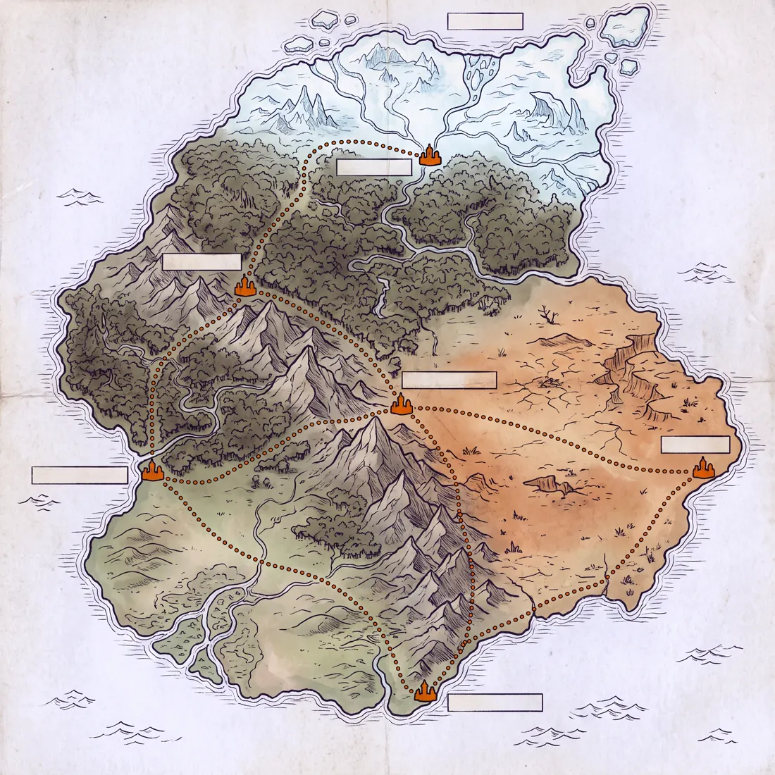
A fantasy board game world map of a continent called [name], square 1:1, rendered as an illustrated overhead map.

The continent contains five distinct biomes: coastal lowlands, dense forest, a mountain range crossing diagonally, arid plains, and a frozen northern edge. Six settlement markers sit at biome boundaries. A path network connects them with dotted trails.

Hand-illustrated cartography style with visible ink texture and subtle parchment grain.

Parchment base in warm [#F2F2FF], ink in [#20113B], biome tints kept desaturated, settlement markers and trail dots in [#F06206].

Constraints: overhead map view only, no place names, no compass rose, no sea monsters, coastline must be a single closed shape.
Product and UX (4 prompts)
Mock-ups for presenting a concept, not for handing over to a developer. For production you still need Figma, but for a conversation with a client this is more than enough.
18Mobile app mock-up
Three screens side by side show a flow, one screen shows only a screen. Always ask for three.
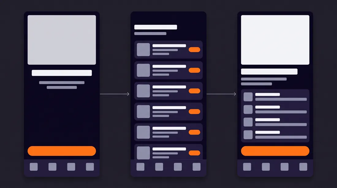
A mobile app UI mockup showing three connected screens for [app purpose], landscape 16:9, phones displayed flat and front-facing in a row with a subtle connecting arrow between them.

Screen 1 is the entry state, screen 2 is the main working view with a list of cards, screen 3 is the detail view. A persistent bottom navigation bar with four icons appears on all three.

Realistic UI proportions: 8-point spacing, 44-pixel tap targets, generous padding.

Modern dark-mode interface design, surface [#0B0617], cards [#20113B], primary text [#F5F6F8], secondary [#9B9DB9], the single primary action button in [#FF7F11].

Constraints: placeholder rectangles instead of real body copy, no device bezels or hands, no drop shadows on cards, one accent colour only.19Analytics dashboard
For sales decks and SaaS landing pages. Do not ask for specific numbers, the model will make them up anyway.
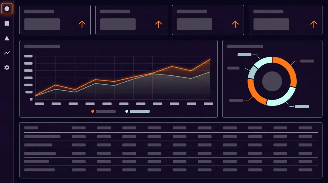
An analytics dashboard interface for [domain], landscape 16:9, laid out on a 12-column grid.

Top row: four compact metric tiles, each with a label, a large number and a small trend indicator. Middle row: one wide line chart occupying eight columns and a donut breakdown occupying four. Bottom row: a data table with five visible rows and a subtle header treatment.

A slim left sidebar carries five navigation icons.

Clean product-design aesthetic, restrained and data-first, no skeuomorphism.

Background [#0B0617], panels [#150826], hairline borders at 10 percent white, chart lines and the active nav item in [#FF7F11], a secondary series in [#C5FEEC].

Constraints: numbers must be short and plausible, no logos, no photographic elements, chart axes must have consistent tick spacing, table rows evenly aligned.20Landing page wireframe
The whole landing page in one tall frame. For showing the structure quickly, before anyone starts coding it.
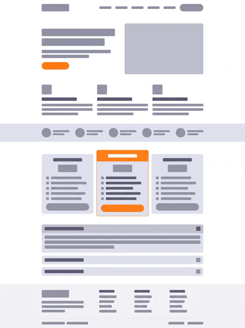
A full-page landing page wireframe for [product], tall portrait format, showing the entire scroll in one continuous image.

Section order from top: navigation bar, hero with headline block and one primary button, three-column feature row, social proof strip, pricing table with three tiers where the middle tier is visually elevated, FAQ accordion, footer.

Grey-box wireframe treatment with real proportional hierarchy, headline blocks noticeably larger than body blocks.

Wireframe greys from [#DDE0E8] down to [#5E5D76] on white, with only the primary button and the elevated pricing tier in [#FF7F11].

Constraints: lorem-style placeholder bars instead of readable text, no imagery inside placeholders, consistent 24-pixel section rhythm, no rounded corners above 12 pixels.21Event signage system
Conferences, trade fairs, open days. One sheet shows the consistency of the whole system better than eight separate files.
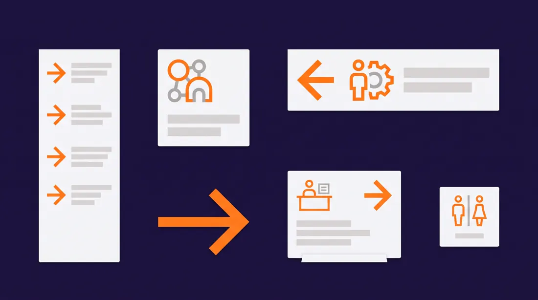
A wayfinding and signage system sheet for a conference called [event name], landscape 16:9, presented as a specimen board with six sign types arranged on a grid.

The six types: a large directional totem, a wall-mounted room identifier, a floor decal arrow, a hanging overhead banner, a desk-height registration sign, and a compact restroom marker.

All six share one geometric icon language, one arrow style and one type scale, so the family reads as a single system.

Bold contemporary signage design, high contrast, generous negative space.

Deep base [#20113B] with type in [#F5F6F8] and all directional arrows in [#FF7F11].

Constraints: text limited to short single words, arrows must all share the same angle geometry, no photographic mockup environment, flat presentation only.
Educational materials (3 prompts)
The category most prone to kitsch. The fix: ban the clipart style explicitly and name a specific illustration reference.
22Visual flashcards
For learning vocabulary, procedures and abbreviations. Six per sheet is the maximum, at nine the model starts losing stylistic consistency.

A sheet of six visual learning flashcards about [topic], landscape 16:9, arranged in a 3x2 grid with equal gutters and rounded card corners.

Each card holds one central illustrated symbol in the upper two thirds and a short label strip in the lower third. All six symbols share identical line weight, identical corner radius and identical visual density so they read as one set.

Friendly educational illustration style, geometric and simplified, closer to modern pictogram design than to cartoon.

Cards in off-white [#F2F2FF], symbols in [#20113B], one accent detail per symbol in [#FF7F11].

Constraints: labels under 15 characters, no clipart aesthetic, no gradients, no drop shadows, symbols must be centred and equally sized across all six cards.23Character card
Games, gamification, training material built on personas. The collectible card layout works even in a corporate context.
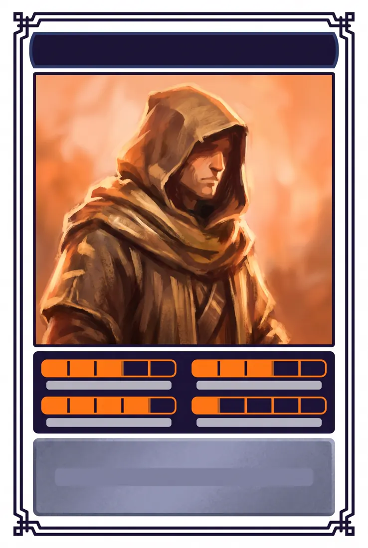
A collectible character card for [character concept], portrait 2:3, framed by a thin ornamental border.

Layout from top: a name banner, a large portrait illustration filling the middle 60 percent, a narrow trait strip with four attribute meters below it, and a short flavour panel at the base.

The four attribute meters are segmented bars, each filled to a different level.

Painterly illustration for the portrait, flat graphic treatment for all framing elements, so the two layers stay visually separate.

Card frame in [#20113B], portrait background glow in [#F06206], attribute meters in [#FF7F11], flavour panel text area in [#9B9DB9].

Constraints: no readable body text, name banner under 18 characters, attribute meters must have identical segment counts, no real-person likeness.24Children's book page
A single page as a style sample. For pitching an idea to a publisher or for material aimed at parents.
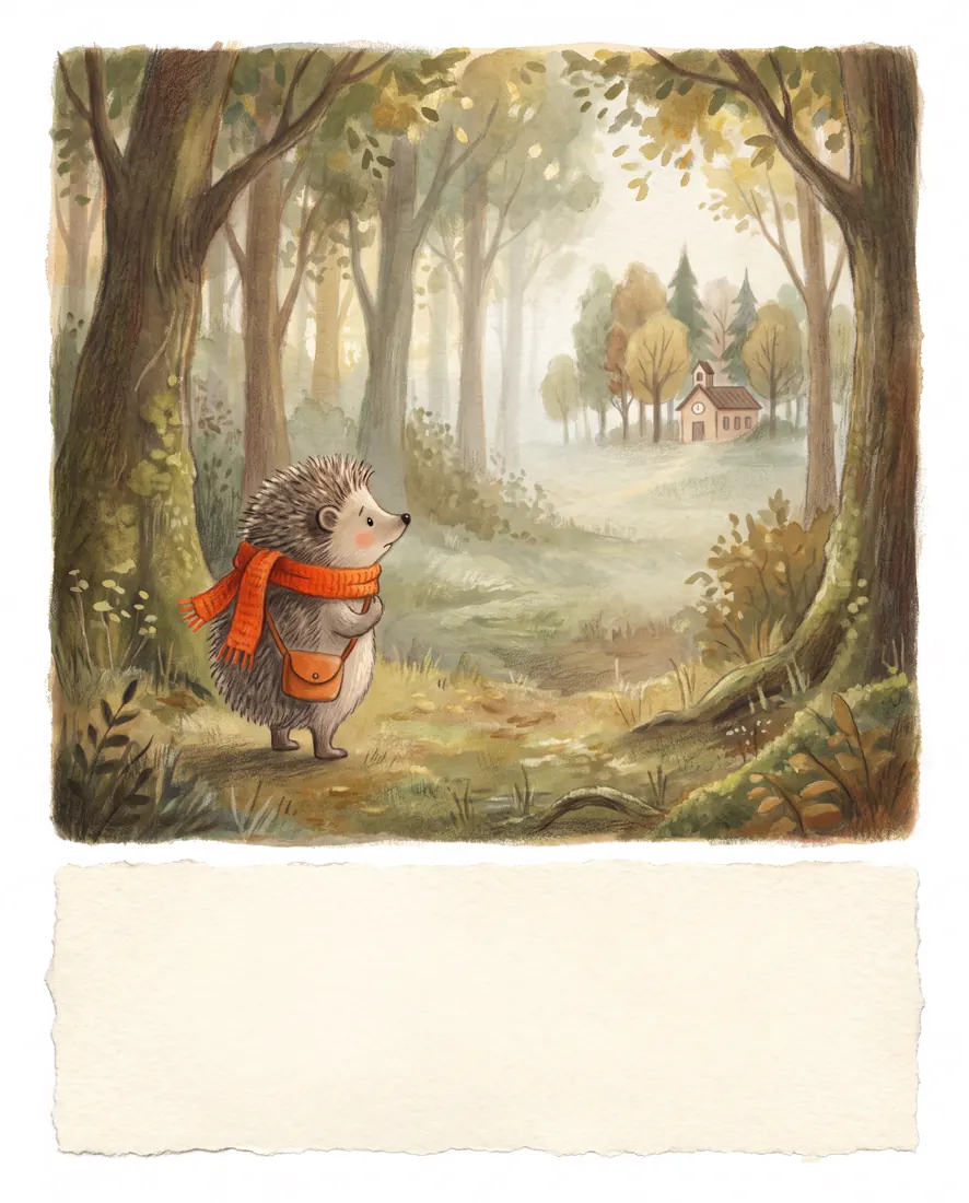
A single children's picture book page featuring [character] who is [emotional situation], portrait 4:5.

The illustration occupies the upper three quarters, with an empty text zone reserved at the bottom. The character is small within a large environment, which visually communicates how the situation feels to them.

Warm gouache-and-coloured-pencil texture, soft edges, visible paper grain, gentle rather than saccharine.

Muted natural palette with one warm accent in [#FF7F11] placed on the character so the eye finds them immediately.

Constraints: leave the bottom text zone completely empty, no text anywhere in the image, character proportions consistent and non-uncanny, no glossy digital rendering.
Branding and packaging (3 prompts)
For moodboards and conversations about direction, not for final identity work. A logo from a generator is not fit for trademark registration, and this is not the place to save money. We cover it in more depth in our comparison of logo generators (in Polish).
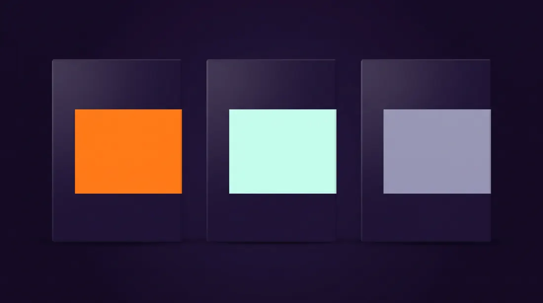
25Brand identity board
One slide that says more about direction than thirty minutes of explaining.
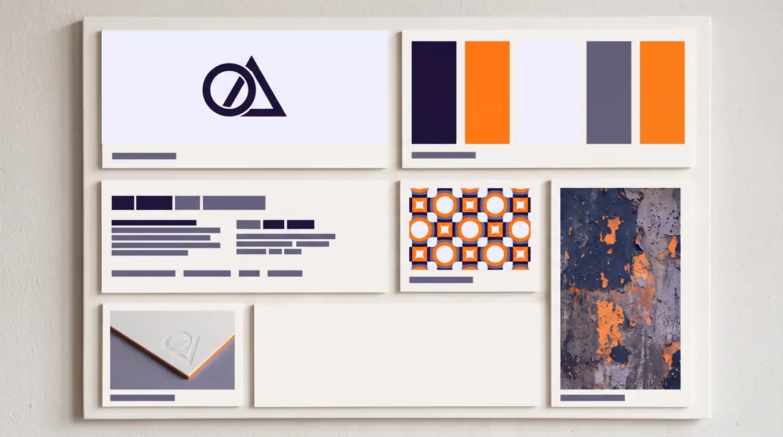
A brand identity presentation board for [brand name], a [industry] company, landscape 16:9, divided into six unequal panels in an editorial grid.

Panels contain: a logo lockup on a clean field, a colour palette shown as five swatches with hex values, a typography specimen showing one display and one text face, a pattern or texture study, a stationery detail, and one atmospheric photographic tile.

The composition should read as a designer's board, not a template: panel sizes vary deliberately.

Sophisticated modern branding aesthetic, restrained, plenty of negative space.

Palette built strictly from [#20113B], [#FF7F11], [#F2F2FF] and [#7D7DA1].

Constraints: logo must be geometric and simple, no more than one photographic tile, swatch hex labels are the only small text, no mockup perspective.26Packaging system
Shows how a brand scales across three product variants. For conversations with FMCG clients.
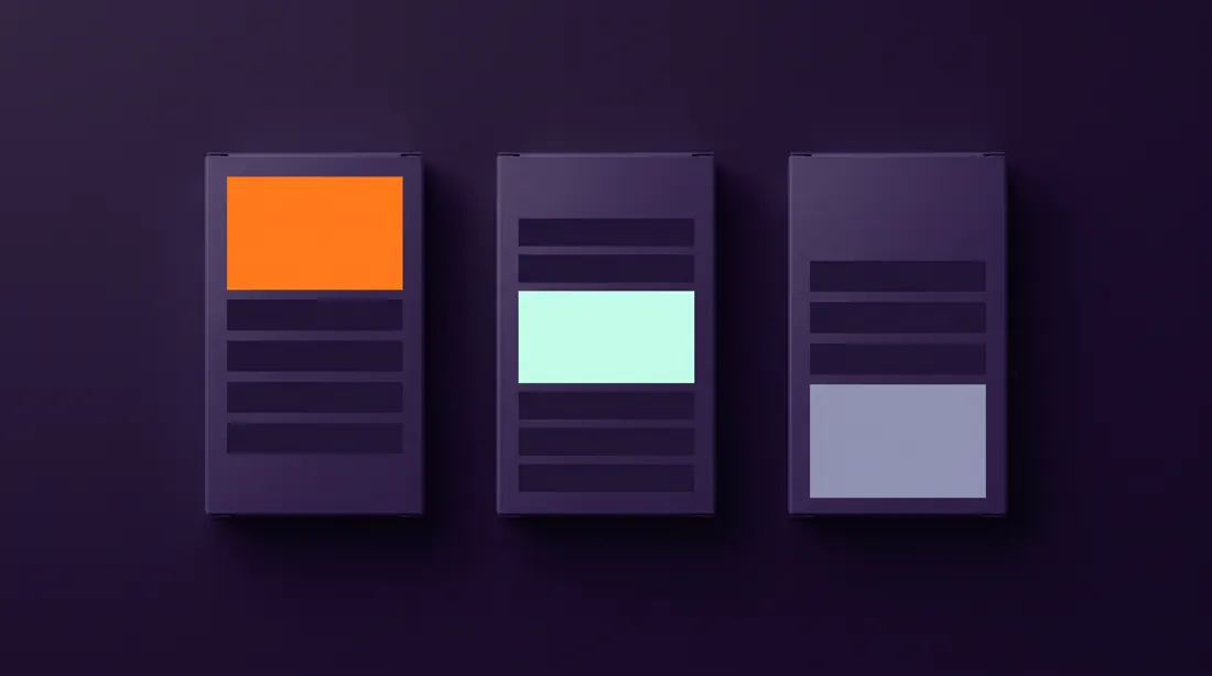
A packaging system showing three product variants of [product line], landscape 16:9, with the three packages standing side by side on a seamless surface, shot straight on.

All three share an identical structural layout: same logo position, same type hierarchy, same panel proportions. Only the variant colour block and the variant name change between them.

The differentiation must be immediately legible from two metres away.

Clean commercial product photography lighting, soft top light with a gentle falloff, subtle contact shadow, seamless background.

Shared elements in [#20113B] and [#F2F2FF], the three variant blocks in [#FF7F11], [#C5FEEC] and [#7D7DA1].

Constraints: identical package silhouettes, variant names under 12 characters, no reflections on the surface, no props, no visible seams on the packaging.27Exploded product view
A classic from technical manuals that works very well on a landing page. It shows complexity without explaining it in words.
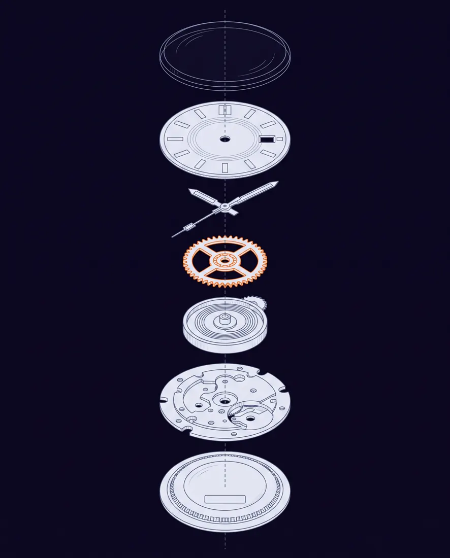
An exploded technical view of [product], portrait 4:5, with all components separated along a single vertical assembly axis.

Components float at even intervals in correct assembly order, connected by thin dashed alignment lines running through the centre of each part. The most important component sits at the visual centre and is rendered slightly larger.

Precise technical illustration style, consistent thin line weights, minimal shading, no photographic realism.

Background [#0B0617], component outlines in [#DDE0E8], alignment lines in [#5E5D76], the highlighted central component in [#FF7F11].

Constraints: strictly one assembly axis, no numbered callouts, no text, parts must be spaced evenly and must not overlap, keep the axis perfectly vertical.
Editorial and photography (3 prompts)
The last category, and the one where knowing print terminology pays off most. The model understands trade terms such as bleed and gutter, so use them instead of describing what you mean.
28Print-ready poster with bleed
Ask for bleed and crop marks and you get a layout you can actually send to the printer without reworking it.
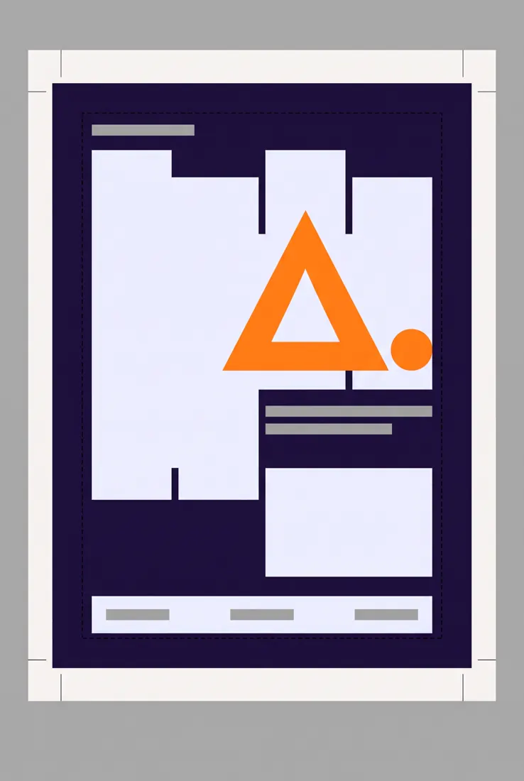
A print-ready event poster layout for [event], portrait 2:3, presented as a pre-press artboard.

Visible pre-press furniture: a 3 mm bleed area extending past the trim edge, crop marks at all four corners, and a dashed safe-area rectangle inset from the trim.

Inside the safe area sits a strong typographic composition: one dominant headline, a secondary date and venue line, and a small sponsor strip at the base.

Bold contemporary poster design in a Swiss-influenced grid, large type contrast, asymmetric balance.

Poster field in [#20113B], headline in [#F2F2FF], one geometric graphic element in [#FF7F11], pre-press marks in thin black.

Constraints: headline under 20 characters, background artwork must run fully into the bleed with no white gaps, no photographic imagery, crop marks must sit outside the trim.29Magazine spread
For presenting an editorial direction. The model understands the term gutter well, so use it explicitly.
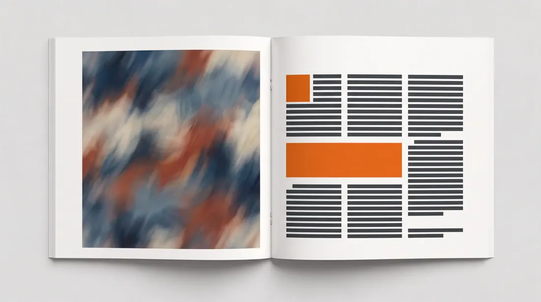
A magazine feature spread about [topic], landscape 16:9 representing two facing pages with a visible centre gutter.

The left page is dominated by a full-bleed image area. The right page carries the editorial layout: a large drop cap opening the body, three text columns, one pull quote breaking across two of them, and a small caption block in the outer margin.

Sophisticated editorial design with a strict baseline grid and confident use of white space.

Paper in [#F5F6F8], body type in [#31343A], the pull quote and drop cap in [#F06206].

Constraints: body copy rendered as realistic greeked text lines rather than readable words, columns must align to a shared baseline, no page numbers, gutter must be clearly visible.30Photo shoot plan
Send this to the photographer instead of describing everything by email. It saves an hour of conversation and one round of revisions.
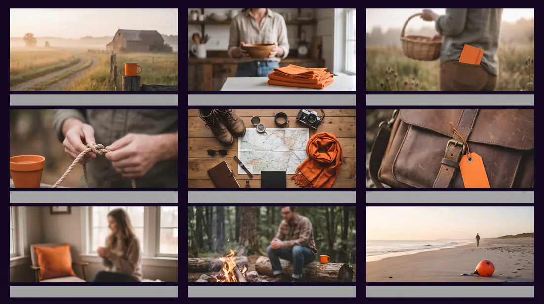
A photography shot list board for a [shoot type] session, landscape 16:9, arranged as a 3x3 grid of reference tiles with a thin label strip under each.

The nine tiles cover a deliberate range: two wide establishing frames, three mid shots, two detail close-ups, one overhead flat lay, and one environmental portrait. Together they must feel like one coherent visual direction, not nine unrelated images.

Each label strip states the shot type and a suggested focal length.

Consistent photographic treatment across all nine: same colour grade, same contrast curve, same light direction.

Muted natural grade with a warm bias, one recurring accent object in [#FF7F11] appearing in at least four tiles to tie the set together.

Constraints: identical tile sizes, no faces in sharp focus, labels under 20 characters, no watermarks, consistent lighting direction across every tile.
What can the model do once you stop describing looks?
Far more than the first thirty suggest. The model does not understand "nice", but it knows knolling, knows what a macro lens does at f/4 and can reproduce the misregistration of a risograph. Below are ten prompts built on the names of techniques instead of adjectives, each with a generated example.
There is one difference, and it does all the work. These prompts do not describe how the image should look. They describe the physical process that produced it: which lens, what angle of light, which printing technique, which flaw in the process.
| Lever | Instead of | Write |
|---|---|---|
| Technique name | neatly arranged objects | forensic knolling layout |
| Equipment | sharp photo | Hasselblad X2D, 120mm macro, f/11 |
| Physics of light | nicely lit | raking light at a 15-degree grazing angle |
| Process flaw | with character | registration offset 2mm, roller streaking |
The last row is the most interesting and the least used. Flaws from printing, scanning and optics are the strongest signal of authenticity you can give. A point cloud without holes looks like a render. A risograph without misregistration looks like a file from a laser printer. An image without flaws looks generated, because it is.
Ten techniques, ten examples (advanced)
Swap the subject, not the technique. Knolling a watch works just as well on the contents of a backpack or the components of a product. What stays the same, the equipment, the light and the process flaws, is what carries the quality.
01Knolling
Showing what a product or service is made of. Works on a service page and in a report.
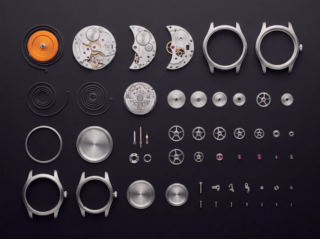
A forensic knolling layout of a fully disassembled mechanical wristwatch, photographed perfectly top-down at exactly 90 degrees with zero perspective distortion.

Every single component is separated and arranged on an invisible grid, aligned to shared horizontal and vertical axes, ordered by size from largest at the top-left to smallest at the bottom-right. Uniform gaps of identical width between all items. Nothing overlaps, nothing is rotated off-axis.

Shot on a Hasselblad X2D with a 120mm macro lens at f/11, a single large softbox directly overhead producing even illumination and almost no shadow. Matte charcoal seamless surface in #0B0617.

The mainspring barrel is anodised #FF7F11 while every other part stays raw brushed steel, so the eye lands in one place.

Editorial style of a Wired magazine teardown feature. CRITICAL: no text, no letterforms, no numbers, no logos, no watermarks anywhere. Any glyph-like shape is a failure.02Copperplate engraving
A report cover or a technical article, where the clash of eras does the work.
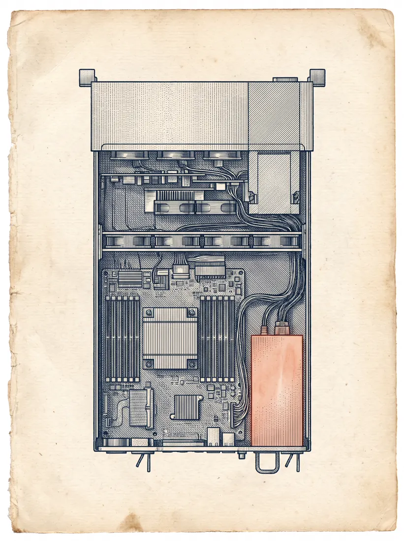
A cutaway cross-section of a modern rack-mounted server, rendered entirely as a 19th-century copperplate engraving.

Fine parallel hatching and stipple shading only. No solid fills, no gradients, no digital shading of any kind: depth is conveyed purely by line density, exactly as in a Vesalius anatomical plate. The cut plane runs dead vertical through the centre of the machine, exposing internal structure with the reverence usually reserved for a dissected body.

Each internal component is individually hatched at a different angle so the layers separate optically.

Printed on aged ivory laid paper #F2F2FF with visible fibre, ink in deep #20113B. One single component is hand-tinted in #F06206, as if coloured decades after printing.

Plate style of Diderot's Encyclopédie. CRITICAL: no text, no letterforms, no numbers, no logos, no watermarks anywhere. Any glyph-like shape is a failure.03Data physicalisation
A chart that does not look like a chart. For an annual report or a results presentation.
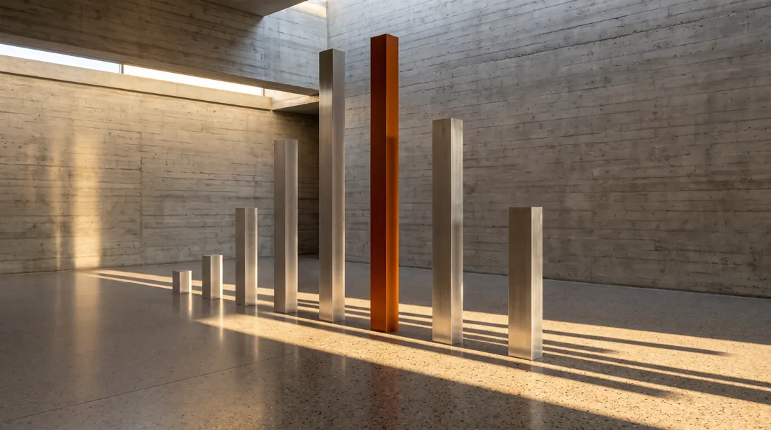
A physical data sculpture standing in a raw board-formed concrete gallery space.

Seven vertical columns machined from solid brushed aluminium, each square in section, heights varying substantially from short to very tall, spaced at exact equal intervals on a polished terrazzo floor. The column heights encode a dataset.

Raking late-afternoon sunlight enters from a high clerestory window at a low angle, casting long hard-edged shadows across the floor. The shadows themselves form a second reading of the same data, stretched and skewed.

The tallest column is anodised #FF7F11; every other column stays raw unfinished metal.

Shot on a Phase One with a 50mm tilt-shift lens, verticals perfectly corrected, no converging lines. Architectural photography for Domus magazine. CRITICAL: no text, no letterforms, no numbers, no logos, no watermarks anywhere. Any glyph-like shape is a failure.04Long exposure
Visualising a flow: a user path, a process, data. No icons, no arrows.

A 30-second long-exposure photograph shot from a fixed position looking straight down onto a dark studio floor.

Points of light were moved through the space during the exposure, leaving continuous smooth trails that map a branching process: one trail enters from the left edge, travels inward, splits into four at a central node, three of the four converge again at the right edge, and the fourth fades out midway with a soft falloff.

Trails glow in warm #FF7F11 with natural intensity falloff and slight blooming where they cross. Background is pure #0B0617 with no visible floor texture. No light source is visible anywhere in frame.

Shot on a Sony A7R V at ISO 100, f/16, tripod-locked, no camera movement. CRITICAL: no text, no letterforms, no numbers, no logos, no watermarks anywhere. Any glyph-like shape is a failure.05Orthographic projection
Product documentation, a spec sheet, a technical section on a website.
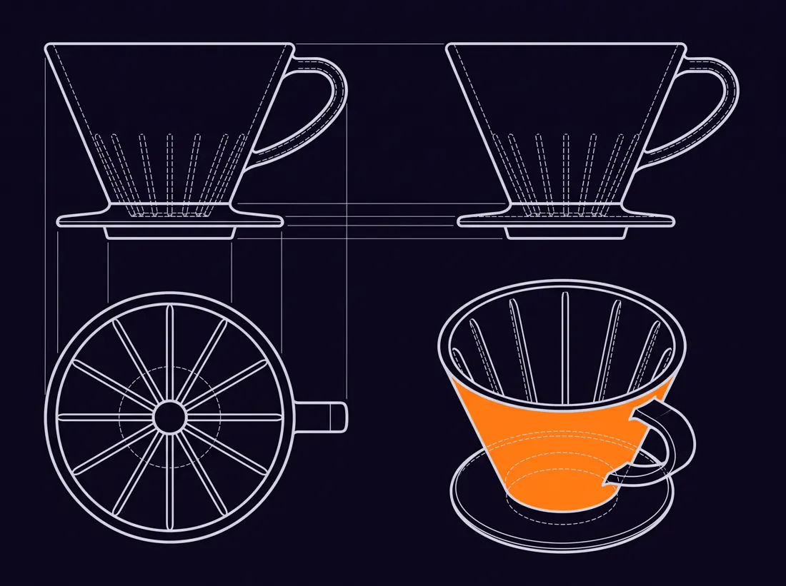
A technical orthographic projection plate of a single ceramic pour-over coffee dripper, laid out as four views on one sheet in strict first-angle projection.

Front elevation top-left, side elevation top-right, plan view from above bottom-left, isometric view bottom-right. All four views share exactly the same scale and sit on shared projection lines, so features align across views.

Exactly two line weights and nothing else: a heavier continuous line for visible edges, a finer dashed line for hidden edges. No shading, no fills, no texture.

Blueprint aesthetic inverted: sheet in #0B0617, all linework in #DDE0E8, and one single surface of the isometric view picked out in #FF7F11.

CRITICAL: no text, no letterforms, no numbers, no logos, no watermarks anywhere. Any glyph-like shape is a failure. No dimension lines, no title block, no border.06Colour channel separation
System architecture or service layers, shown without a single labelled rectangle.
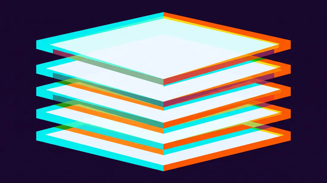
An abstract composition in which a single geometric form has been split into three offset colour channels, as if printed from a misaligned three-strip Technicolor negative.

The form is a stack of five horizontal planes seen at a slight angle from below. The warm channel sits offset noticeably to the right and slightly down; the cool channel offset equally to the left and slightly up; the base layer stays centred. Where all three overlap they blend toward near-white. Where they separate they leave clean hard-edged chromatic fringes.

The misregistration is deliberate and consistent across the whole frame, never random.

Background #150826. Channels tinted #F06206, #C5FEEC and #F5F6F8.

Crisp edges throughout, absolutely no motion blur and no glow. CRITICAL: no text, no letterforms, no numbers, no logos, no watermarks anywhere. Any glyph-like shape is a failure.07Scale jump
Storytelling from the general to the specific in one frame. A strong opener for an article.
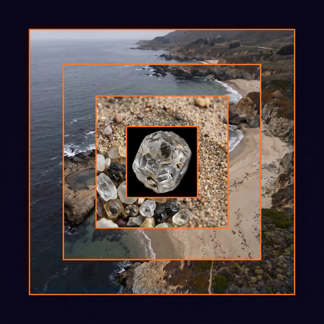
A single square composition showing the same subject at five nested magnifications, arranged as concentric inset frames.

The outermost frame shows a wide aerial view of a coastline. Each inner frame zooms one order of magnitude deeper into the exact optical centre of the previous one: coastline, then beach, then a patch of sand, then individual grains, then the crystalline surface of one grain.

Each frame boundary is marked by a thin #FF7F11 rule. The zoom must be physically plausible and continuous: what reads as flat texture at one level resolves into real structure at the next.

Muted natural palette throughout, sitting on an #0B0617 surround. Even lighting at every scale so the levels read as one system, not five photographs.

CRITICAL: no text, no letterforms, no numbers, no logos, no watermarks anywhere. Any glyph-like shape is a failure. No arrows, no magnifier graphics, no connecting lines between frames.08Risograph with misregistration
A poster, a cover, event material. An aesthetic that digital printing cannot fake.
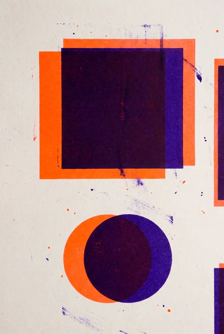
A two-colour risograph print with deliberate registration error.

Only two inks exist in this image: fluorescent orange #FF7F11 and deep violet #20113B, printed on uncoated off-white #F2F2FF stock with clearly visible paper tooth.

The violet layer is offset a couple of millimetres right and slightly down from the orange layer. Where the two inks overlap they multiply into a dense near-black; where they separate, clean single-ink zones appear at every edge.

Authentic press artefacts throughout: visible ink roller streaking in the large solid areas, slight ghosting below dense shapes, uneven coverage, tiny specks of misplaced ink.

Bold geometric composition built from heavy simple shapes. No fine detail, no thin lines, nothing that a risograph could not physically hold. CRITICAL: no text, no letterforms, no numbers, no logos, no watermarks anywhere. Any glyph-like shape is a failure.09Photogrammetry point cloud
Digital twins, spaces, technology topics. It looks like a capture from a real scan.
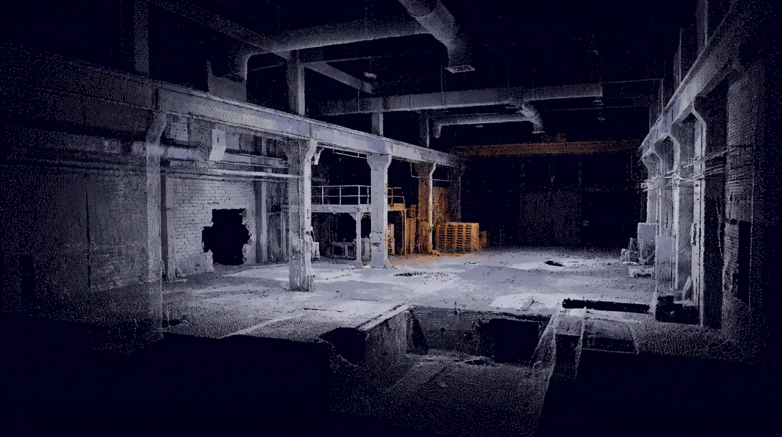
A photogrammetric point cloud reconstruction of an empty industrial interior, rendered as discrete unconnected points floating in absolute void.

Point density varies exactly as it would in a real capture: dense and coherent on surfaces that faced the scanner directly, sparse and noisy where surfaces sat at grazing angles, and completely absent in occluded areas, leaving honest visible holes in the geometry.

Individual points are tiny, one to two pixels, never merging into solid surfaces. Structural edges and corners read clearly because they accumulated more samples; soft and distant surfaces dissolve into scattered noise.

Points carry desaturated colour sampled from source photography: mostly #DDE0E8 and #9B9DB9, with one region of the space accumulating in #FF7F11.

Background pure #0B0617. CRITICAL: no text, no letterforms, no numbers, no logos, no watermarks anywhere. Any glyph-like shape is a failure. No wireframe, no mesh, no connecting lines between points.10Macro at 5:1
A hero background, a texture, an abstract image behind a headline. Unrecognisable, so it will not date.
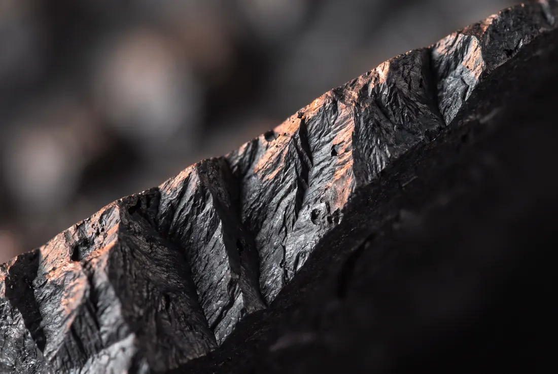
An extreme macro photograph at 5 to 1 magnification, so close that the subject becomes entirely unrecognisable and reads as pure abstract topography.

The subject is the fractured edge of a graphite block. Razor-thin depth of field: one single sharp band runs diagonally across the frame from lower-left to upper-right, and everything falls away into smooth creamy bokeh within millimetres on both sides.

Raking light from the left at a very low grazing angle reveals every ridge, pit and fracture plane as a hard-edged shadow, giving the surface the character of an aerial view of a mountain range.

Shot on a Laowa 25mm ultra-macro at f/4, focus-stacked only within the sharp band.

Natural graphite colour, cool and dark, with a warm #FF7F11 rim highlight where the light catches the highest ridges. CRITICAL: no text, no letterforms, no numbers, no logos, no watermarks anywhere. Any glyph-like shape is a failure.
How do you write a prompt that is not on the list?
Fill in five fields: format, purpose, composition, style and constraints. These are the same five parts as above, laid out as blanks. Thirty prompts will not cover every case, and there will always be a thirty-first. The template below works for all of them, provided you do not skip the last field.
Create a [format] of [subject], [aspect ratio].

Purpose: the image must [explain / compare / sell / teach / present] [what exactly] to [audience].

Composition: [grid or layout], [number of elements], reading order [direction], [what dominates the frame].

Style: [named aesthetic], [line weight or rendering], palette limited to [#hex], [#hex], [#hex].

Constraints: no [what you never want], text under [N] characters per label, [the one rule that must not break].
Fill in all five fields, even if one seems obvious. Especially the last one. Constraints do more than a style description, because by default the model pulls towards the most average result it saw in training.
What most often ruins the result?
Four things: colours given by name instead of hex, too much text on the image, changing style and layout in the same revision, and not banning perspective on plans. Each one can be fixed in a single sentence.
- Colour names are a suggestion to the model, not an instruction. "Orange" covers everything from yellow to red. A brand has one hex value. Write
#FF7F11and repeat it for every element that should take it. This is the single change that fixes the most. - Above twenty-five characters, text falls apart. The model does not write letters, it draws shapes that resemble them. Short labels come out. Sentences do not. With diacritics, such as the Polish ą or ę, the limit is lower still.
- Changing style and layout at once is a dead end. When the result is wrong, you cannot tell which change broke it. Get the composition right with a neutral style first, and only then add the visual layer to the working prompt.
- By default the model drifts into perspective. For plans and layouts, write "strictly overhead view, no perspective" in so many words. Without it you get a handsome 3D visualisation instead of the plan you needed.
There is a fifth thing, though it is less a trap than a way of working. When a prompt does not land first time, that is not a failure. Set it up, look at what came out, change one component, repeat. It is the same loop we describe in loop engineering, only shorter and with an image at the end.
How much does a page with thirty generated images weigh?
Uncompressed, 75.7 megabytes, which is more than any page can reasonably be expected to load. The raw output of the model is PNG files of one and a half to three megabytes each. After conversion to WebP at a width of 1100 pixels, the set of thirty-five images we measured in August 2026 came down to 1.28 megabytes. That is 98.3 percent less.
This is not cosmetic. Thirty images at two megabytes each make a page nobody will finish reading, and it drags down Core Web Vitals, the loading and responsiveness metrics covered in our technical SEO work. Conversion takes a single command and the difference is invisible to the naked eye on screen. If you generate images for publication, treat it as a mandatory step, not an optional one.
Will it replace a designer?
No, but it will replace a stage you used to pay for: the one where you commissioned a visualisation of an idea just to find out whether the idea made sense. Final files, a consistent system and print preparation are still done by a person. What changes is what that person receives as input.
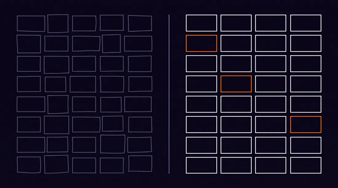
In practice it looks like this: you generate fifteen directions in an hour, choose one, and only that one goes to the designer. They get something concrete instead of a brief described in words, and you do not pay for rejected concepts. The rest of the stack, from logos to brand materials, is collected in our review of AI branding tools (in Polish).
Our twenty-five hits out of thirty sound good, but that is one run on one model. Do not treat it as a law of physics. Treat it as a reference point you did not have before, because nobody had counted it.
Common questions
How many attempts does an image prompt need to land?
With a prompt built from five components, usually one. In a Neurise test in August 2026, twenty-five of thirty prompts produced an image matching the brief at the first attempt, which is 83 percent. Floor plans and UX mock-ups did best, landing in full. Storyboards did worst, two out of four.
Should image prompts be written in English?
In our experience, yes. English prompts hit style, composition and technical terms more precisely. Prompts written in Polish worked, but lost the layout more often and mixed up trade terms such as bleed or isometric. The text inside the image itself can still be in another language.
Does the model render accented characters correctly?
Partly. Short labels of up to about 25 characters usually come out well, but diacritics such as the Polish ą, ę, ś and ż can get lost or deformed. For graphics with a lot of text, it is safer to generate the background without lettering and add the text in an editor.
How much text can an AI-generated image hold?
The practical limit is about 25 characters per block of text. Beyond that the model starts dropping letters, duplicating words or producing shapes that look like letters but are not. In infographics, split the text into short labels instead of sentences.
Can images from ChatGPT Images 2.0 be used commercially?
Under OpenAI's terms, the user holds the rights to generated images and may use them commercially. Check this before every rollout, though, because the terms change, and the risk of resembling existing trademarks is a separate question.
Why does the model ignore my brand colours?
Most likely because you give them by name. To the model, 'orange' is a range from yellow to red. Give hex values, for example #FF7F11, and repeat them for every element that should take that colour.
What if a prompt gets the style right but the layout wrong?
Separate the two. First generate with a description of the composition alone and a neutral style until the layout is right. Then add the style layer to the working prompt. Changing both at once means you cannot tell which element broke the result.
Sources and methodology
- Adobe, Creators' Toolkit Report, October 2025, a sample of more than 16,000 creators in 8 countries. Accessed 4 August 2026.
- OpenAI, Terms of Use, rights to generated content. Accessed 4 August 2026.
- OpenAI Help Center, Image generation FAQ, capabilities and limits of the generator. Accessed 4 August 2026.
- Promptowy, 30 useful prompts for ChatGPT Images 2.0 (in Polish), the source of the category layout and the list of use cases. Accessed 27 July 2026.
Test methodology. Thirty prompts in seven categories, model gemini-3-pro-image (Nano Banana Pro), August 2026, one generation per prompt, the same palette in each. We counted a hit when the image matched the requested layout, number of elements and palette. Visual assessment by a single reviewer, not blind. Thirty is a small sample on one model, so treat 83 percent as a reference point, not a universal value.
What is deliberately missing. Widely repeated figures such as "76 percent of designers use AI" or "150 million monthly users" are left out, because on checking they lead to no primary study, only to sites repeating one another. The Adobe figure concerns emerging and semi-professional creators publishing on social media, not full-time creative professionals, so it is not a figure about designers.
The category layout and the list of thirty use cases come from the Promptowy article. We wrote every prompt from scratch, in English, using the five-part structure. The limit of about 25 characters per text block is an observation from our tests, not an official OpenAI specification. Check licence terms before every commercial use, because they change more often than the documentation.
Read next
Find out whether AI recommends your company.
Start with the free SEO and GEO audit, delivered in 5 working days. We check how the models describe your brand and hand back a prioritised list of changes.