30 promptów do ChatGPT Images 2.0, które da się użyć w pracy
Storyboardy, infografiki, rzuty, makiety i branding. Trzydzieści promptów po angielsku, gotowych do wklejenia, plus szablon na wszystko, czego tu nie ma.
Milo Barczynski (@miuoshek)11 min czytania27 lipca 2026
W skrócie: prompt do Images 2.0 działa, gdy ma pięć składników: typ, cel, kompozycję, styl i ograniczenia. Przetestowaliśmy tak zbudowanych trzydzieści promptów w sierpniu 2026. Dwadzieścia pięć trafiło za pierwszym razem, pięć wymagało przepisania. Wszystkie trzydzieści znajdziesz niżej, po angielsku, bo w tym języku model trafia precyzyjniej.
Najważniejsze fakty
25 z 30 promptów trafiło za pierwszym razem (83 procent). Test własny, model Nano Banana Pro, sierpień 2026.
Rzuty i makiety UX trafiły w komplecie, storyboardy najsłabiej: 2 z 4. Twarda geometria bije opis fabuły.
Kolory zawsze w hex, nigdy nazwą. Przy hexach paleta zgadzała się w 30 przypadkach na 30.
Limit tekstu na grafice: około 25 znaków na blok. Powyżej litery zaczynają się rozpadać.
Kompresja obowiązkowa: 75,7 MB surowych PNG zeszło do 1,28 MB po konwersji do WebP.
Dlaczego prompty do generowania obrazów nie działają?
Bo opisujesz wygląd zamiast układu. Model dostaje "ładny storyboard" i musi sam zgadnąć liczbę paneli, siatkę oraz kolejność czytania. Zgaduje przeciętnie. W naszym teście trzydziestu promptów z sierpnia 2026 te, które podawały układ wprost, trafiły za pierwszym razem w dwudziestu pięciu przypadkach. Pozostałe pięć wymagało przepisania.
Pierwszy raz odpaliłem Images 2.0 o 23:40, bo na rano potrzebowałem planszy ujęć. Wpisałem "storyboard reklamy kawy, ładny, nowoczesny". Dostałem osiem paneli, na których ta sama osoba pije coś brązowego w ośmiu prawie identycznych pozach.
Poprawiłem. Dodałem "profesjonalny", potem "kinowy", potem "jak z agencji". Za każdym razem to samo, tylko w innym filtrze.
Problem nie był w modelu. Napisałem życzenie zamiast briefu.
Grafik, któremu powiesz "zrób coś ładnego", też odda ci osiem identycznych paneli. Albo zapyta o dziesięć rzeczy, zanim tknie ołówek. Model nie zapyta. Zgadnie.
Z czego składa się prompt, który działa?
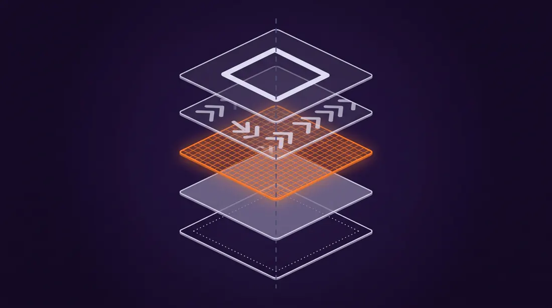
Z pięciu części: typu, celu, kompozycji, stylu i ograniczeń. Wytnij jedną, a model zaimprowizuje dokładnie w tym miejscu. Kolejność też coś znaczy, bo początek promptu waży więcej niż koniec. Dlatego typ idzie pierwszy, a ograniczenia na sam koniec, gdzie działają jak filtr na gotowym pomyśle.
Przewiń, żeby zobaczyć wszystkie pięć po kolei.
Składnik 1 z 5
Typ i temat
Nazwij format, nie nastrój. Model zna słowo "storyboard" i wie, że to siatka paneli. Nie zna słowa "ładny".
Zamiast: ładna grafika o kawie Napisz: an 8-panel storyboard grid for a 30-second coffee ad
Pięć warstw jednego promptu. Wywal którąkolwiek, a model zaimprowizuje dokładnie w tym miejscu. Obraz wygenerowany przez Nano Banana Pro promptem z tego wpisu.
To ta sama logika, którą stosujemy przy pisaniu treści pod cytowanie przez AI: najpierw konkret, potem kontekst. Opisaliśmy ją szerzej w tekście o pisaniu answer-first, żeby AI cytowało.
Ile prób potrzeba, żeby prompt trafił?
Przy tej strukturze zwykle jedna. Przepuściliśmy wszystkie trzydzieści promptów z tego wpisu przez model Nano Banana Pro w sierpniu 2026 i sprawdziliśmy, ile z nich za pierwszym podejściem dało obraz zgodny z briefem. Wynik: dwadzieścia pięć na trzydzieści, czyli 83 procent. Pięć wymagało przepisania promptu.
Nie znaleźliśmy żadnego badania, które by to mierzyło. Pierwsza strona wyników na "AI image generation statistics" to w całości serwisy powtarzające te same liczby bez linku do źródła, więc policzyliśmy sami.
Kategorie z twardą geometrią, czyli rzuty i makiety, trafiają bezbłędnie. Sypie się tam, gdzie prompt opisywał sekwencję opowieści zamiast układu paneli. Dane własne, Neurise, sierpień 2026.
Wzorzec jest jednoznaczny. Rzuty, plany i makiety UX trafiły w komplecie, bo tam prompt podaje twardą geometrię: liczbę kolumn, kąt izometrii, proporcje. Sypnęło się przy storyboardach, gdzie opisywałem łuk narracyjny zamiast siatki paneli. Wszystkie pięć nieudanych miało tę samą wadę i naprawiła je ta sama poprawka: zamiast opisu fabuły podać wprost, ile paneli, w jakiej siatce i co siedzi w każdym.
Dla porównania skali zjawiska: w badaniu Adobe Creators' Toolkit Report z października 2025, na próbie ponad 16 tysięcy twórców z ośmiu krajów, 86 procent zadeklarowało używanie generatywnego AI w swoim workflow. Warto od razu zaznaczyć, bo bywa to przekręcane: Adobe badało twórców publikujących w social mediach i wprost wykluczyło z próby zawodowych projektantów. To nie jest liczba o grafikach.
Trzydzieści promptów: który do czego?
Siedem kategorii, od plansz ujęć po plany sesji zdjęciowej. Prompty są po angielsku i wklejasz je bez zmian, bo nawiasy kwadratowe to jedyne miejsca do podmiany na swoje. Wszędzie, gdzie pojawia się kolor, siedzi wartość hex zamiast nazwy, i nie jest to przypadek. Wróci do tego sekcja o pułapkach.
Storyboardy i wideo
4 prompty
Do momentu, w którym trzeba pokazać sekwencję, a nie pojedynczy kadr. Klucz: wymuś siatkę i numerację paneli, inaczej dostaniesz jeden duży obraz.
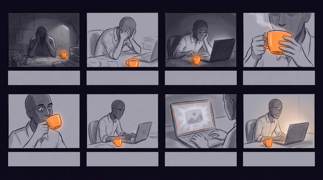
01Plansza ujęć reklamy 30-sekundowej
Do prezentacji pomysłu klientowi, zanim ktokolwiek wynajmie kamerę. Osiem paneli to standard na trzydzieści sekund.
Wynik tego promptu, model Nano Banana Pro
A professional 8-panel storyboard grid for a 30-second [product category] commercial, landscape 16:9, panels numbered 1 to 8 in a 4x2 layout with thin dividing lines.
Narrative arc across the panels: [beat 1: the problem], [beat 2: discovery], [beat 3: the turn], [beat 4: the payoff].
Each panel is a clean pencil-and-marker sketch with a visible camera direction label underneath, such as WIDE, CLOSE UP, OVER SHOULDER, TRACKING.
Muted greyscale linework with a single accent colour [#FF7F11] used only on the product.
Constraints: no photographic rendering, no text inside the panels other than the camera labels, no faces in extreme detail, keep each panel readable at thumbnail size.
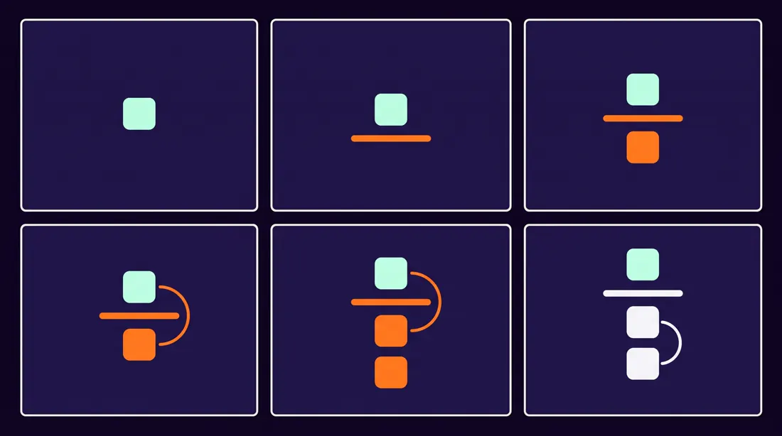
02Storyboard animacji edukacyjnej
Gdy tłumaczysz proces, a nie sprzedajesz produkt. Sześć paneli wystarcza na jeden koncept.
Wynik tego promptu, model Nano Banana Pro
A 6-panel storyboard for a short explainer animation about [concept], landscape 16:9, arranged in a 3x2 grid with generous white space between panels.
The sequence teaches one idea: [what the viewer should understand by the end]. Panel 1 poses the question, panels 2 to 5 build the explanation one layer at a time, panel 6 states the conclusion visually.
Flat vector illustration style, rounded geometric shapes, friendly and non-corporate. Palette limited to [#20113B], [#FF7F11] and off-white [#F5F6F8].
Constraints: no gradients, no drop shadows, no more than three shapes per panel, no written sentences, only simple icons and arrows.
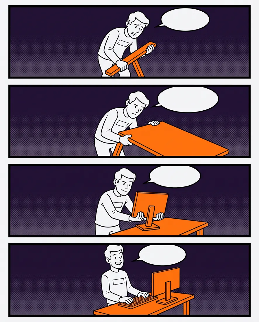
03Komiks instruktażowy
Instrukcja, którą ktoś faktycznie przeczyta. Sprawdza się w onboardingu i w materiałach BHP.
Wynik tego promptu, model Nano Banana Pro
A 4-panel instructional comic strip showing how to [complete the task], portrait 4:5, panels stacked vertically with clear black borders.
A single recurring character performs the steps in order. Their expression shifts from uncertain in panel 1 to confident in panel 4. Each panel isolates exactly one action so the reader cannot merge two steps.
Clean line-art comic style, bold outlines, flat fills, halftone texture in the backgrounds only. Accent colour [#FF7F11] marks the object being acted on in every panel.
Constraints: empty speech bubbles that I will fill later, no captions, no hands rendered in more than four fingers, consistent character design across all panels.
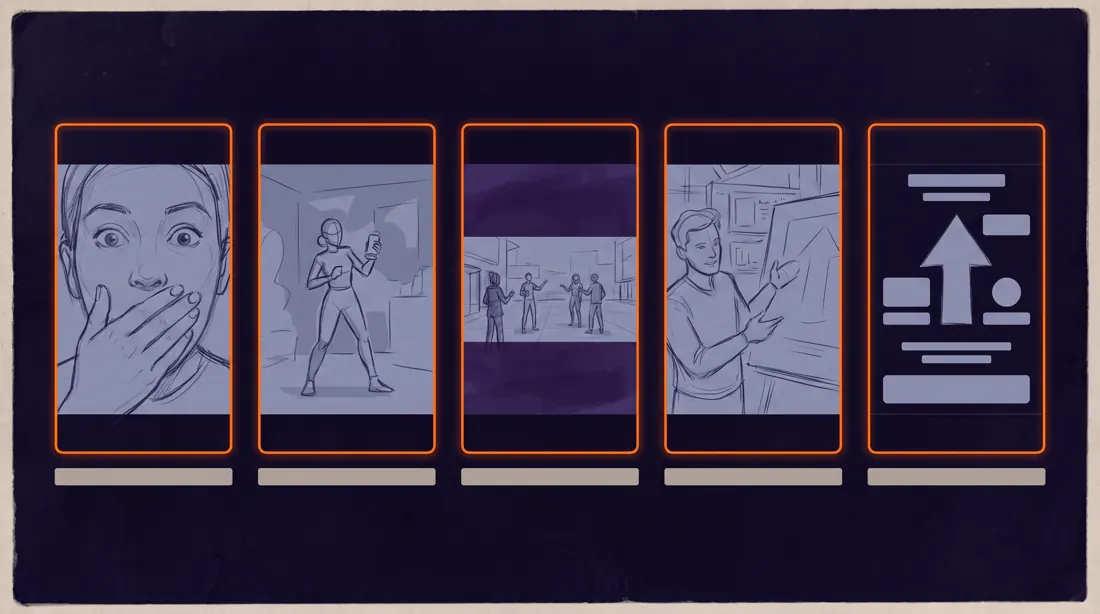
04Plan ujęć do rolki pionowej
Reels, TikTok, Shorts. Pionowa siatka wymusza myślenie w kadrze 9:16 od początku, a nie przycinanie poziomu na końcu.
Wynik tego promptu, model Nano Banana Pro
A shot-planning sheet for a 15-second vertical social video about [topic], landscape 16:9 canvas containing five 9:16 phone-shaped frames in a single row.
Frame 1 is the hook, frames 2 to 4 carry the content beat by beat, frame 5 is the call to action. Under each frame sits a thin label strip showing the shot type and its duration in seconds.
Minimal editorial sketch style on a dark background [#0B0617], frames outlined in [#FF7F11], interior sketches in light grey [#9B9DB9].
Constraints: keep all sketch content inside the safe area away from the top and bottom 12 percent of each frame, no platform logos, no readable body text.
Infografiki i diagramy
7 promptów
Najtrudniejsza kategoria, bo wymaga tekstu, a tekst to najsłabsza strona każdego generatora. Trzymaj etykiety poniżej dwudziestu pięciu znaków i nie próbuj wciskać zdań.
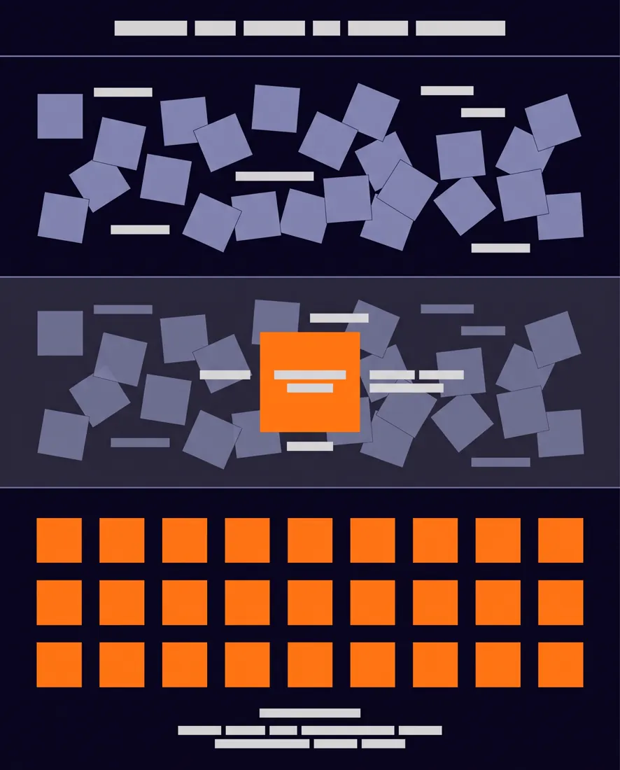
05Infografika problem i rozwiązanie
Najbardziej uniwersalny format sprzedażowy. Trzy sekcje w pionie czytają się na telefonie bez zoomu.
Wynik tego promptu, model Nano Banana Pro
A vertical 4:5 infographic titled "[max 25 characters]", built as three stacked horizontal bands separated by hairline rules.
Band 1 shows the problem as a cluster of tangled, chaotic elements. Band 2 shows the cause as a single highlighted node inside that cluster. Band 3 shows the resolution as the same elements arranged into a clean grid.
The visual argument must be readable without any text: chaos becomes order from top to bottom.
Modern flat design on a deep background [#0B0617], structural elements in [#9B9DB9], the highlighted cause and the resolution in [#FF7F11].
Constraints: only the title carries text, every other label is a short 2-word tag, no stock icons, no photographs, no rainbow gradients.
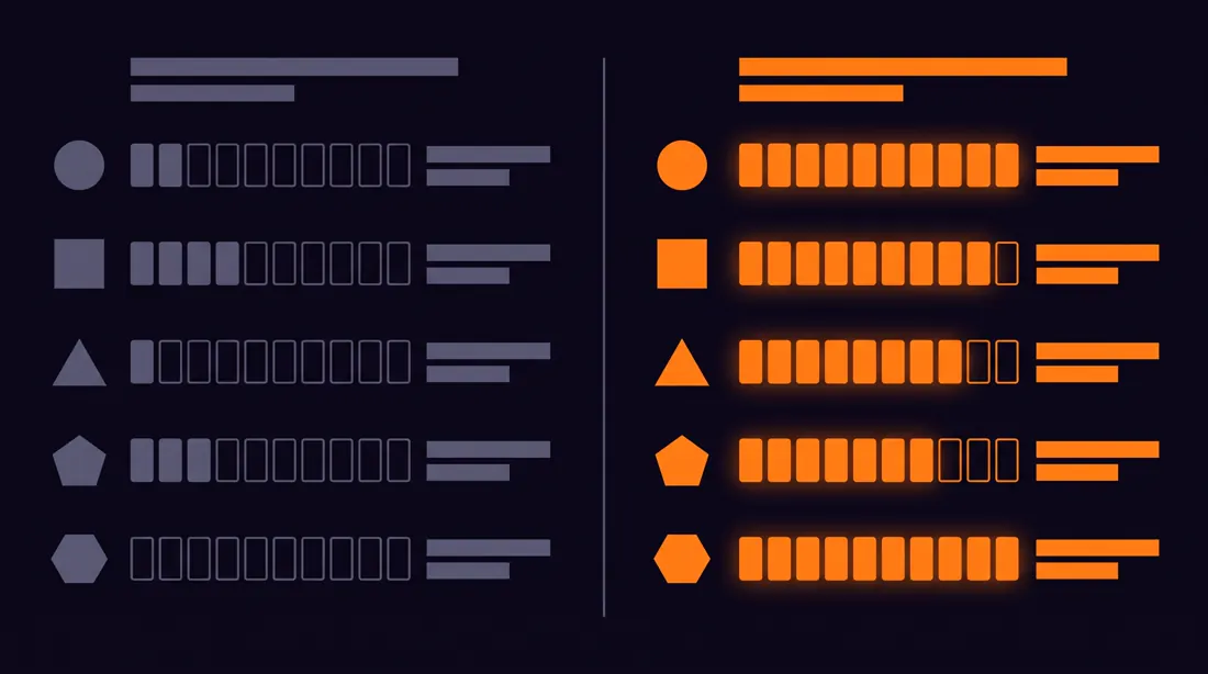
06Infografika porównawcza
Do zestawień typu A kontra B. Symetria po lewej i prawej jest tu jedyną rzeczą, która musi się zgadzać.
Wynik tego promptu, model Nano Banana Pro
A side-by-side comparison infographic contrasting [option A] with [option B], landscape 16:9, split down the middle by a vertical divider.
Both halves use an identical row structure so the eye can scan across: five comparison rows, each represented by a simple icon on the left column and a filled progress indicator on the right.
The left half is rendered in muted grey [#5E5D76] and the right half in the accent [#FF7F11], making the recommended option obvious without stating it.
Clean Swiss-influenced layout, generous margins, strong typographic hierarchy.
Constraints: labels no longer than 3 words, no checkmark or cross symbols, no faces, keep the divider perfectly centred.
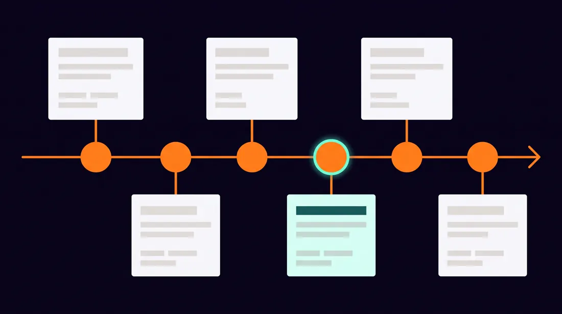
07Oś czasu
Historia firmy, roadmapa, etapy projektu. Poziomo, jeśli etapów jest do sześciu, pionowo powyżej.
Wynik tego promptu, model Nano Banana Pro
A horizontal timeline infographic covering [period or process], landscape 16:9, with a single continuous spine running left to right across the middle of the canvas.
Six milestone nodes sit on the spine at uneven intervals reflecting real time gaps, not decorative spacing. Each node alternates its label block above and below the spine to avoid collisions.
Each milestone carries a year in monospace type and one short descriptor beneath it.
Editorial data-visualisation style on [#0B0617], spine and nodes in [#FF7F11], labels in [#F5F6F8], secondary text in [#9B9DB9].
Constraints: descriptors under 20 characters, no arrows other than the spine itself, no decorative illustrations, equal node sizes.
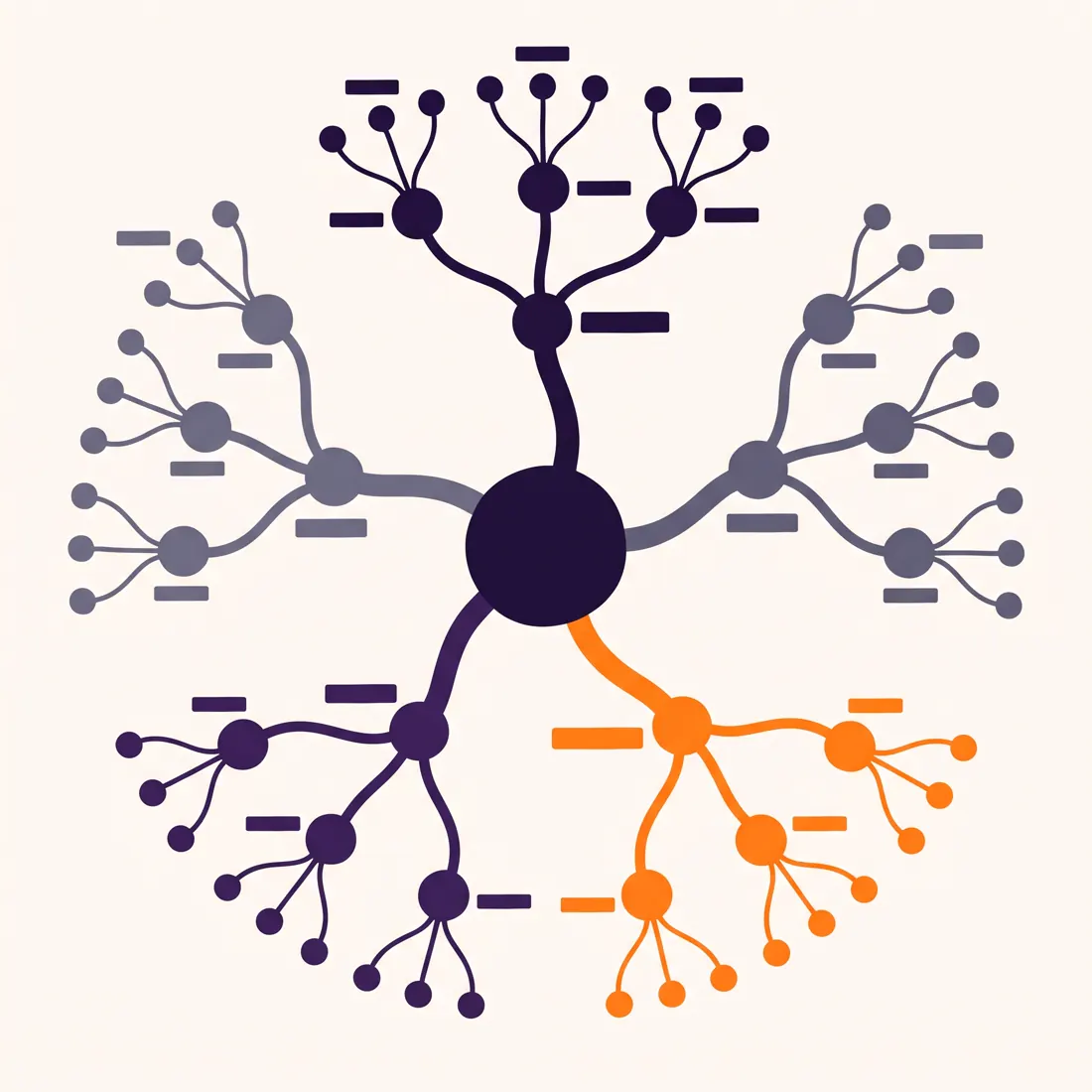
08Mapa myśli
Do burzy mózgów i do porządkowania tematu przed pisaniem. Ogranicz do trzech poziomów, wyżej robi się nieczytelnie.
Wynik tego promptu, model Nano Banana Pro
A radial mind map centred on the concept [central topic], square 1:1, with the core node placed dead centre.
Five primary branches radiate outward at even angles. Each primary branch splits into exactly three secondary nodes. Branch thickness decreases with each level so hierarchy is visible at a glance.
Node labels are short tags, never sentences. The central node is visually heaviest.
Hand-drawn-meets-digital style, smooth curved connectors rather than straight lines, on off-white [#F5F6F8] with branches cycling through [#20113B], [#7D7DA1] and [#FF7F11].
Constraints: exactly three levels of depth, no crossing connectors, labels under 18 characters, no icons inside nodes.
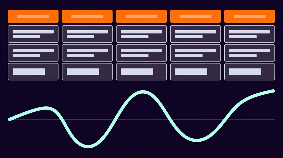
09Mapa ścieżki klienta
Warsztat ze sprzedażą albo audyt lejka. Krzywa emocji pod spodem jest tym, co odróżnia to od zwykłej osi.
Wynik tego promptu, model Nano Banana Pro
A customer journey map for [persona] buying [product or service], landscape 16:9, structured as five vertical stage columns: Awareness, Consideration, Decision, Onboarding, Retention.
Each column contains three stacked rows: the customer action at the top, the touchpoint in the middle, and the internal owner at the bottom.
Below the columns runs a continuous emotion curve that dips at the friction points and rises at the wins, drawn as a smooth line.
Clean consulting-deck aesthetic on [#0B0617], column headers in [#FF7F11], the emotion curve in [#C5FEEC], body cells in [#DDE0E8].
Constraints: cell text limited to 3 words, no photographs, no avatar illustrations, the emotion curve must visibly cross below the baseline at least once.
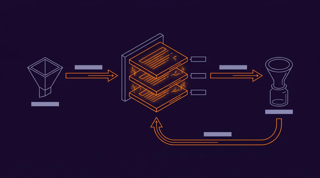
10Schemat działania usługi
Jak to działa w trzech krokach, tylko rysunkiem. Do strony ofertowej i do deków.
Wynik tego promptu, model Nano Banana Pro
A service mechanism diagram explaining how [service] works, landscape 16:9, drawn as a left-to-right flow with three primary stages connected by directional arrows.
Stage 1 shows the input, stage 2 shows the processing layer rendered as a stack of three thin horizontal plates, stage 3 shows the output. A feedback loop arrow returns from stage 3 to stage 2 along a curved path underneath.
Isometric technical illustration, thin consistent line weights, subtle depth without heavy shading.
Deep background [#150826], structure lines in [#9B9DB9], the active processing layer and all arrows in [#FF7F11].
Constraints: no server or cloud clichés, no human figures, stage labels under 15 characters, arrow direction must be unambiguous.
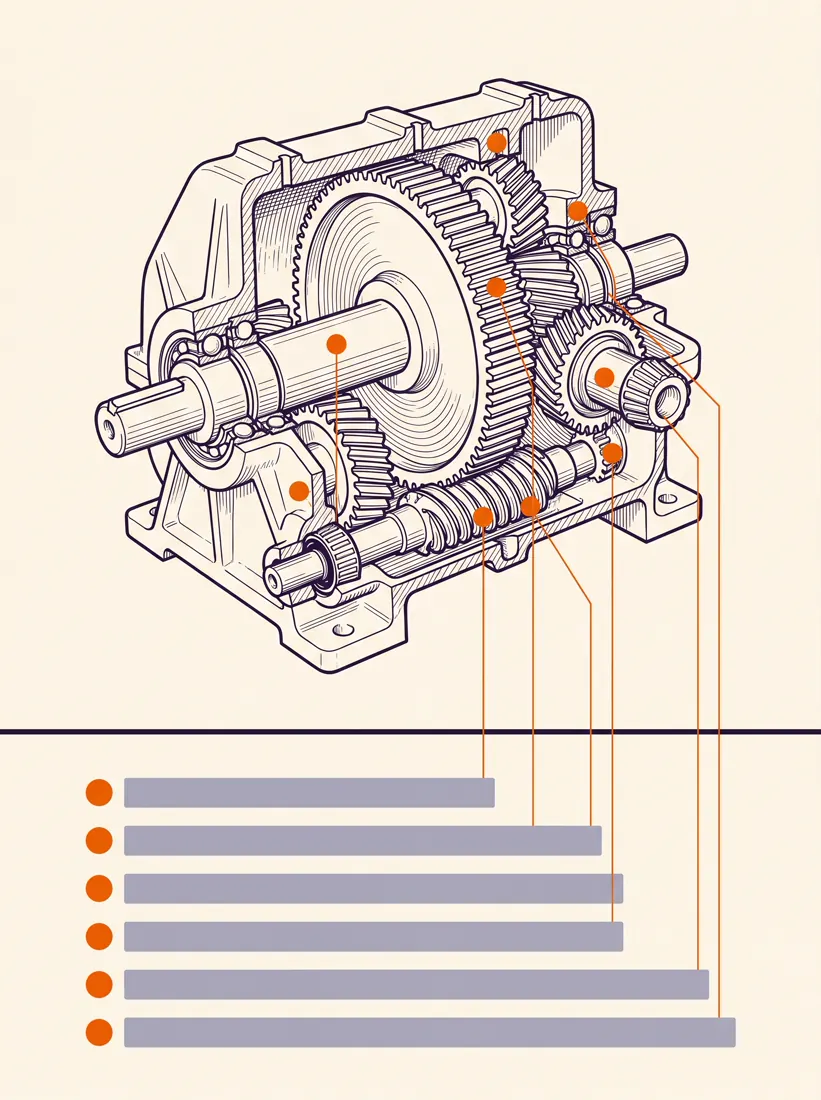
11Plansza edukacyjna z diagramem
Do szkoleń i materiałów wewnętrznych. Format klasycznej planszy szkolnej, ale bez estetyki lat osiemdziesiątych.
Wynik tego promptu, model Nano Banana Pro
An educational wall chart explaining [subject], portrait 3:4, with a single large cutaway diagram occupying the upper two thirds and a labelled legend strip across the bottom third.
The main diagram is annotated with six thin leader lines pointing to numbered parts. The legend maps each number to a short name.
Scientific illustration style with precise linework and restrained cross-hatching, printed on warm off-white [#F2F2FF], ink in [#20113B], numbered callouts in [#F06206].
Constraints: leader lines must not cross each other, legend entries under 20 characters, no decorative borders, no gradient fills.
Rzuty i plany przestrzenne
6 promptów
Tu Images 2.0 zaskakuje najbardziej. Warunek jest jeden: trzeba wprost napisać, że to widok z góry, bo domyślnie model ciągnie w stronę perspektywy.
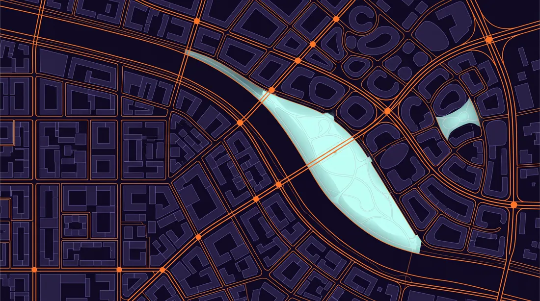
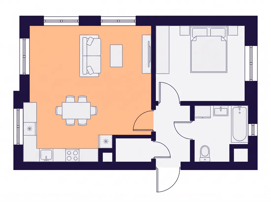
Efekt promptu numer 12 z tej listy. Zwróć uwagę, że nigdzie nie ma perspektywy, bo prompt tego wprost zabrania.
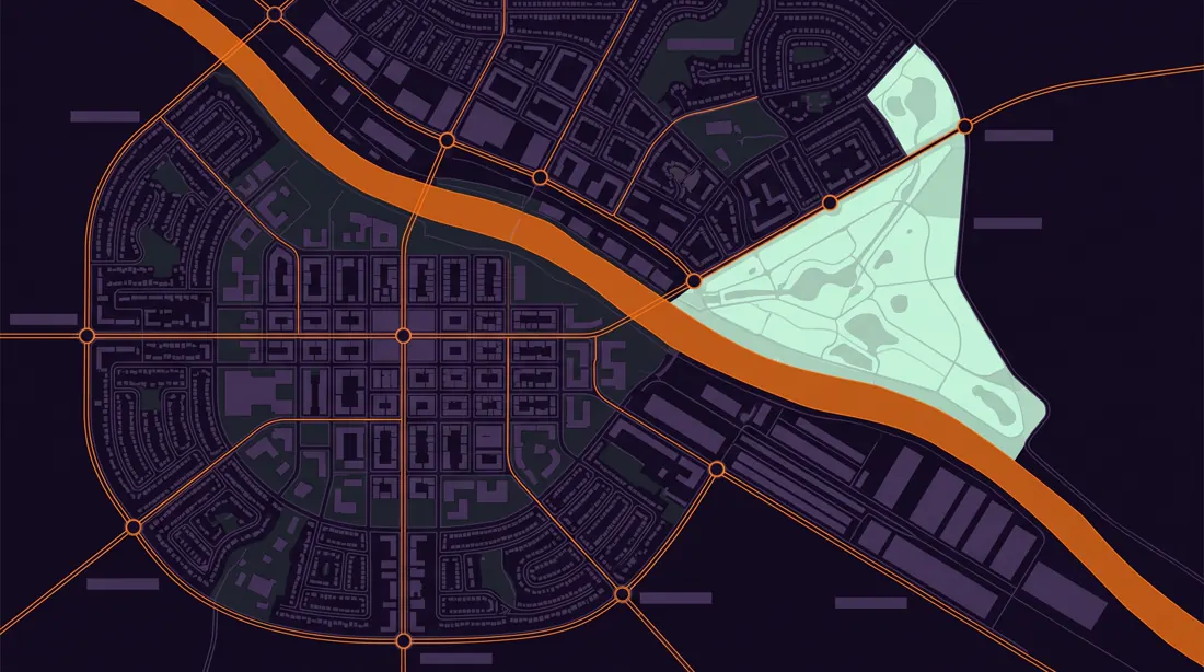
12Rzut miasta przyszłości
Do prezentacji wizji, okładek raportów i tła pod hasło. Efektowne i zaskakująco tanie w produkcji.
Wynik tego promptu, model Nano Banana Pro
A detailed top-down city plan of a fictional sustainable metropolis called [city name], landscape 16:9, viewed as a flat orthographic map with no perspective distortion.
The city is organised around a river running diagonally across the canvas. Distinct districts are legible by their block geometry: a dense grid core, an organic residential ring, a linear industrial strip along the water, and a wedge of parkland.
Transit lines cross the map as clean coloured strokes with circular interchange markers.
Architectural site-plan aesthetic, thin precise linework, flat fills, no buildings rendered in 3D.
Base in [#0B0617], built form in [#2C1850], parkland in [#C5FEEC], transit and the river edge in [#FF7F11].
Constraints: strictly overhead view, no street names, no compass rose, no lens flare, keep the river continuous from edge to edge.
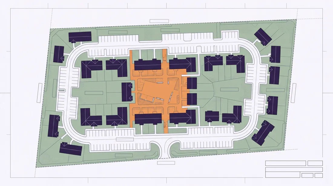
13Rzut osiedla
Deweloperka i wizualizacje inwestycji. Mniejsza skala niż miasto, więc więcej detalu na jednostkę powierzchni.
Wynik tego promptu, model Nano Banana Pro
A residential development site plan for [number] housing units, landscape 16:9, drawn as a flat overhead architectural plan.
Buildings are shown as simple footprint shapes with roof lines indicated. A single access road loops through the site with parking bays along its edge. Green space occupies at least one third of the plot, including a central shared courtyard.
Individual plot boundaries are drawn as thin dashed lines.
Professional architectural drawing style, consistent 1 to 500 scale feel, minimal fills.
Paper background [#F5F6F8], linework in [#4F5060], building footprints in [#20113B], landscaping in soft green, the courtyard highlighted in [#FF7F11].
Constraints: overhead only, no trees rendered individually, no cars, no text labels, keep roads continuous and connected.
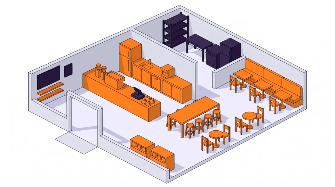
14Izometryczny plan lokalu
Kawiarnia, biuro, showroom. Izometria czyta się lepiej niż płaski rzut, gdy pokazujesz to klientowi, a nie wykonawcy.
Wynik tego promptu, model Nano Banana Pro
An isometric cutaway floor plan of a [venue type] interior, landscape 16:9, drawn at a true 30-degree isometric angle with the front wall removed.
The layout reads clearly: entrance zone, service counter, seating area with mixed table sizes, and a back-of-house strip. Furniture is simplified but proportionally correct. Wall height is low enough to see the whole floor.
Clean isometric vector illustration, flat colour with a single soft shadow per object, no texture.
Floor in warm [#F2F2FF], walls in [#DDE0E8], furniture in [#20113B], the service counter and all seating in [#FF7F11].
Constraints: strict isometric projection with no vanishing point, no people, no plants larger than the furniture, all objects aligned to the same grid.
15Rzut mieszkania
Ogłoszenia nieruchomości i materiały sprzedażowe. Model radzi sobie z tym lepiej niż z czymkolwiek innym w tej kategorii.
Wynik tego promptu, model Nano Banana Pro
A clean 2D floor plan of a [number]-room apartment of approximately [area] square metres, landscape 4:3, viewed strictly from above.
Rooms are separated by walls drawn as solid dark bands of consistent thickness. Door swings are shown as quarter-circle arcs. Windows appear as breaks in the wall with a thin double line.
Each room contains minimal furniture indicating its function: bed, sofa, dining table, kitchen counter, bathroom fixtures.
Modern real-estate floor plan style, flat and legible, no shadows.
Walls in [#20113B], floor fills in very light [#F5F6F8], furniture outlines in [#9B9DB9], the living area floor tinted [#FF7F11] at 10 percent opacity.
Constraints: absolutely no perspective, no room labels, no dimension strings, walls must fully enclose every room with no gaps except doors.
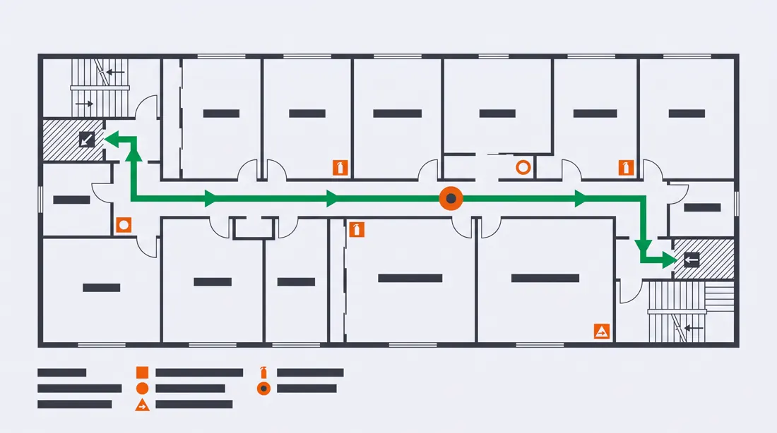
16Mapa ewakuacji
Uwaga: to materiał poglądowy, nie dokument zgodny z normą. Do makiety i do prezentacji tak, do wywieszenia na ścianie nie.
Wynik tego promptu, model Nano Banana Pro
An emergency evacuation plan for a single floor of an office building, landscape 16:9, drawn as a flat overhead plan.
The floor layout shows corridors, rooms and two stairwells at opposite ends. A bold continuous escape route traces from the centre of the floor to both exits. Assembly point and fire equipment positions are marked with simple geometric symbols.
A YOU ARE HERE marker sits at one clearly defined position.
Standard safety-signage visual language, high contrast, flat fills, no decoration.
Background in [#F5F6F8], walls in [#31343A], escape routes in vivid green, equipment markers in [#DB0819].
Constraints: overhead only, symbols must be geometric and unambiguous, no text beyond the single YOU ARE HERE label, routes must never dead-end.
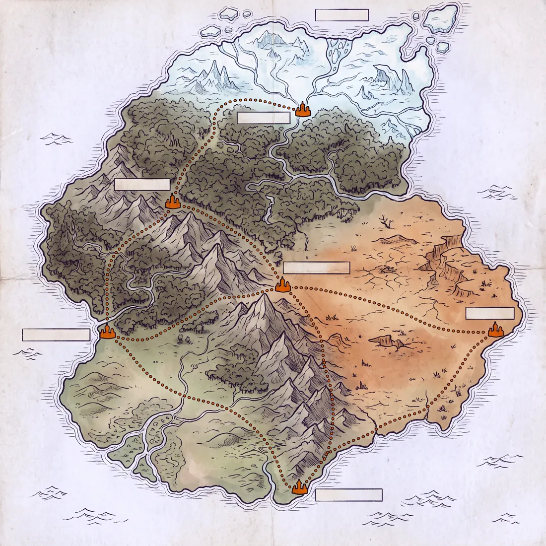
17Mapa do gry planszowej
Prototypy gier, materiały na eventy, grywalizacja w onboardingu. Format, w którym można sobie pozwolić na więcej stylu.
Wynik tego promptu, model Nano Banana Pro
A fantasy board game world map of a continent called [name], square 1:1, rendered as an illustrated overhead map.
The continent contains five distinct biomes: coastal lowlands, dense forest, a mountain range crossing diagonally, arid plains, and a frozen northern edge. Six settlement markers sit at biome boundaries. A path network connects them with dotted trails.
Hand-illustrated cartography style with visible ink texture and subtle parchment grain.
Parchment base in warm [#F2F2FF], ink in [#20113B], biome tints kept desaturated, settlement markers and trail dots in [#F06206].
Constraints: overhead map view only, no place names, no compass rose, no sea monsters, coastline must be a single closed shape.
Produkt i UX
4 prompty
Makiety do prezentacji koncepcji, nie do oddania developerowi. Do produkcji i tak potrzebujesz Figmy, ale do rozmowy z klientem to wystarcza w zupełności.
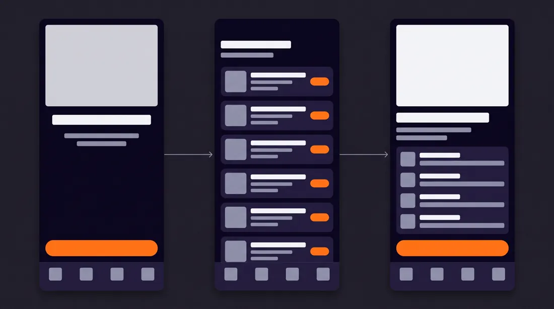
18Makieta aplikacji mobilnej
Trzy ekrany obok siebie pokazują przepływ, jeden ekran pokazuje tylko ekran. Zawsze proś o trzy.
Wynik tego promptu, model Nano Banana Pro
A mobile app UI mockup showing three connected screens for [app purpose], landscape 16:9, phones displayed flat and front-facing in a row with a subtle connecting arrow between them.
Screen 1 is the entry state, screen 2 is the main working view with a list of cards, screen 3 is the detail view. A persistent bottom navigation bar with four icons appears on all three.
Realistic UI proportions: 8-point spacing, 44-pixel tap targets, generous padding.
Modern dark-mode interface design, surface [#0B0617], cards [#20113B], primary text [#F5F6F8], secondary [#9B9DB9], the single primary action button in [#FF7F11].
Constraints: placeholder rectangles instead of real body copy, no device bezels or hands, no drop shadows on cards, one accent colour only.
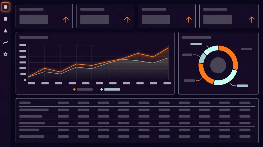
19Panel analityczny
Do deków sprzedażowych i landingów SaaS. Nie proś o konkretne liczby, model i tak je zmyśli.
Wynik tego promptu, model Nano Banana Pro
An analytics dashboard interface for [domain], landscape 16:9, laid out on a 12-column grid.
Top row: four compact metric tiles, each with a label, a large number and a small trend indicator. Middle row: one wide line chart occupying eight columns and a donut breakdown occupying four. Bottom row: a data table with five visible rows and a subtle header treatment.
A slim left sidebar carries five navigation icons.
Clean product-design aesthetic, restrained and data-first, no skeuomorphism.
Background [#0B0617], panels [#150826], hairline borders at 10 percent white, chart lines and the active nav item in [#FF7F11], a secondary series in [#C5FEEC].
Constraints: numbers must be short and plausible, no logos, no photographic elements, chart axes must have consistent tick spacing, table rows evenly aligned.
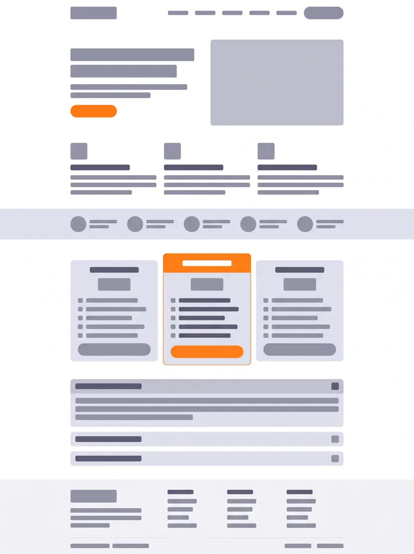
20Makieta strony docelowej
Cały landing w jednym kadrze pionowym. Do szybkiego pokazania struktury, zanim ktoś zacznie ją kodować.
Wynik tego promptu, model Nano Banana Pro
A full-page landing page wireframe for [product], tall portrait format, showing the entire scroll in one continuous image.
Section order from top: navigation bar, hero with headline block and one primary button, three-column feature row, social proof strip, pricing table with three tiers where the middle tier is visually elevated, FAQ accordion, footer.
Grey-box wireframe treatment with real proportional hierarchy, headline blocks noticeably larger than body blocks.
Wireframe greys from [#DDE0E8] down to [#5E5D76] on white, with only the primary button and the elevated pricing tier in [#FF7F11].
Constraints: lorem-style placeholder bars instead of readable text, no imagery inside placeholders, consistent 24-pixel section rhythm, no rounded corners above 12 pixels.
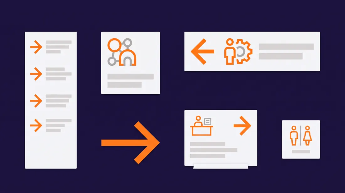
21System oznaczeń wydarzenia
Konferencje, targi, dni otwarte. Jeden arkusz pokazuje spójność całego systemu lepiej niż osiem osobnych plików.
Wynik tego promptu, model Nano Banana Pro
A wayfinding and signage system sheet for a conference called [event name], landscape 16:9, presented as a specimen board with six sign types arranged on a grid.
The six types: a large directional totem, a wall-mounted room identifier, a floor decal arrow, a hanging overhead banner, a desk-height registration sign, and a compact restroom marker.
All six share one geometric icon language, one arrow style and one type scale, so the family reads as a single system.
Bold contemporary signage design, high contrast, generous negative space.
Deep base [#20113B] with type in [#F5F6F8] and all directional arrows in [#FF7F11].
Constraints: text limited to short single words, arrows must all share the same angle geometry, no photographic mockup environment, flat presentation only.
Materiały edukacyjne
3 prompty
Kategoria, w której najłatwiej o kicz. Ratunek: wprost zakaż stylu clipart i podaj konkretną referencję ilustratorską.
22Fiszki wizualne
Do nauki słówek, procedur i skrótów. Sześć na arkusz to maksimum, przy dziewięciu model zaczyna gubić spójność stylu.
Wynik tego promptu, model Nano Banana Pro
A sheet of six visual learning flashcards about [topic], landscape 16:9, arranged in a 3x2 grid with equal gutters and rounded card corners.
Each card holds one central illustrated symbol in the upper two thirds and a short label strip in the lower third. All six symbols share identical line weight, identical corner radius and identical visual density so they read as one set.
Friendly educational illustration style, geometric and simplified, closer to modern pictogram design than to cartoon.
Cards in off-white [#F2F2FF], symbols in [#20113B], one accent detail per symbol in [#FF7F11].
Constraints: labels under 15 characters, no clipart aesthetic, no gradients, no drop shadows, symbols must be centred and equally sized across all six cards.
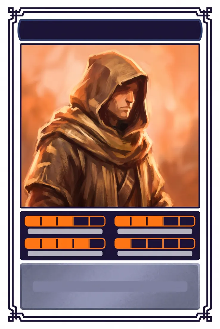
23Karta postaci
Gry, grywalizacja, materiały szkoleniowe z personami. Układ karty kolekcjonerskiej działa nawet w kontekście korporacyjnym.
Wynik tego promptu, model Nano Banana Pro
A collectible character card for [character concept], portrait 2:3, framed by a thin ornamental border.
Layout from top: a name banner, a large portrait illustration filling the middle 60 percent, a narrow trait strip with four attribute meters below it, and a short flavour panel at the base.
The four attribute meters are segmented bars, each filled to a different level.
Painterly illustration for the portrait, flat graphic treatment for all framing elements, so the two layers stay visually separate.
Card frame in [#20113B], portrait background glow in [#F06206], attribute meters in [#FF7F11], flavour panel text area in [#9B9DB9].
Constraints: no readable body text, name banner under 18 characters, attribute meters must have identical segment counts, no real-person likeness.
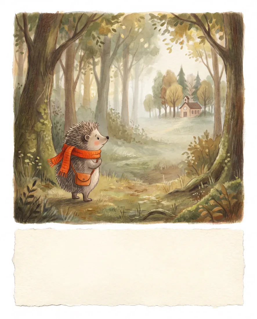
24Strona książki dla dzieci
Pojedyncza rozkładówka jako próbka stylu. Do pitchowania pomysłu wydawcy albo do materiałów dla rodziców.
Wynik tego promptu, model Nano Banana Pro
A single children's picture book page featuring [character] who is [emotional situation], portrait 4:5.
The illustration occupies the upper three quarters, with an empty text zone reserved at the bottom. The character is small within a large environment, which visually communicates how the situation feels to them.
Warm gouache-and-coloured-pencil texture, soft edges, visible paper grain, gentle rather than saccharine.
Muted natural palette with one warm accent in [#FF7F11] placed on the character so the eye finds them immediately.
Constraints: leave the bottom text zone completely empty, no text anywhere in the image, character proportions consistent and non-uncanny, no glossy digital rendering.
Branding i opakowania
3 prompty
Do moodboardów i rozmów o kierunku, nie do finalnej identyfikacji. Logo z generatora nie nadaje się do rejestracji i nie próbuj na tym oszczędzać, o czym piszemy szerzej w porównaniu generatorów logo.
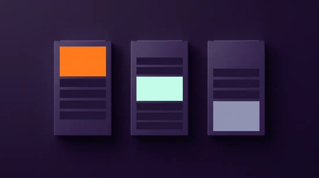
Prompt numer 26. Identyczne sylwetki, jedna zmienna. Tak wygląda system, a nie trzy osobne projekty.
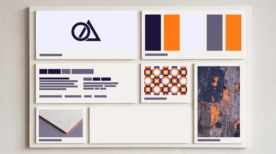
25Plansza identyfikacji marki
Jeden slajd, który mówi o kierunku więcej niż trzydzieści minut opowiadania.
Wynik tego promptu, model Nano Banana Pro
A brand identity presentation board for [brand name], a [industry] company, landscape 16:9, divided into six unequal panels in an editorial grid.
Panels contain: a logo lockup on a clean field, a colour palette shown as five swatches with hex values, a typography specimen showing one display and one text face, a pattern or texture study, a stationery detail, and one atmospheric photographic tile.
The composition should read as a designer's board, not a template: panel sizes vary deliberately.
Sophisticated modern branding aesthetic, restrained, plenty of negative space.
Palette built strictly from [#20113B], [#FF7F11], [#F2F2FF] and [#7D7DA1].
Constraints: logo must be geometric and simple, no more than one photographic tile, swatch hex labels are the only small text, no mockup perspective.
26System opakowań
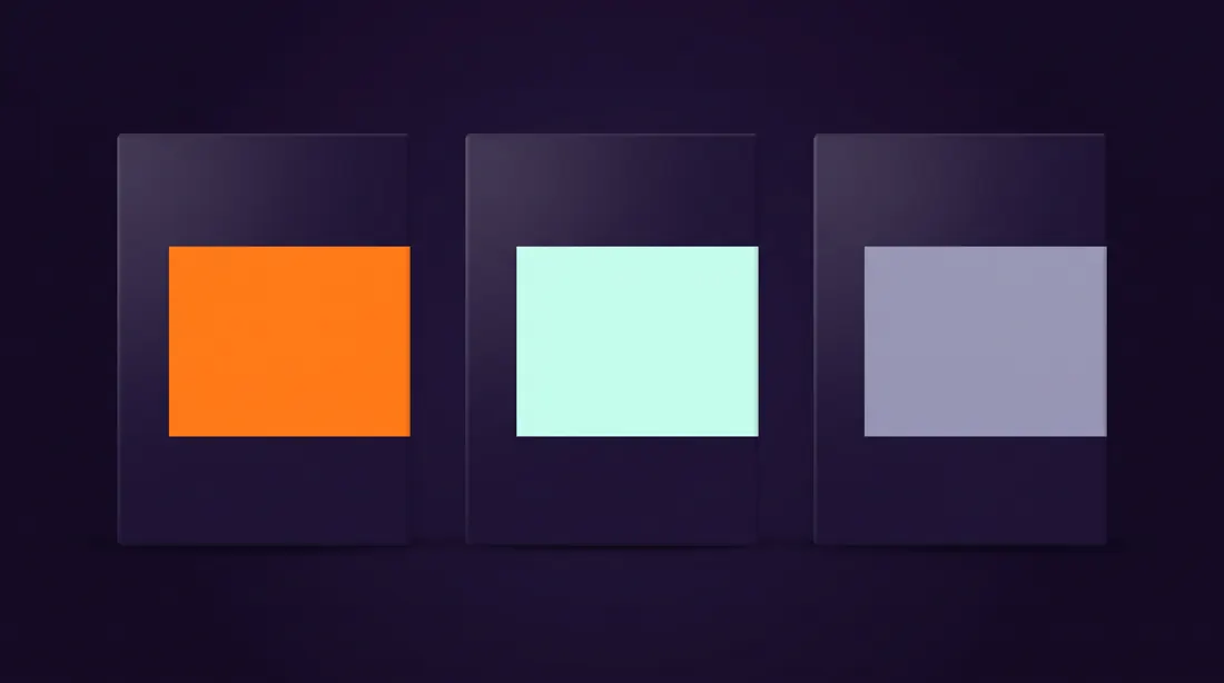
Pokazuje, jak marka skaluje się na trzy warianty produktu. Do rozmów z klientem FMCG.
Wynik tego promptu, model Nano Banana Pro
A packaging system showing three product variants of [product line], landscape 16:9, with the three packages standing side by side on a seamless surface, shot straight on.
All three share an identical structural layout: same logo position, same type hierarchy, same panel proportions. Only the variant colour block and the variant name change between them.
The differentiation must be immediately legible from two metres away.
Clean commercial product photography lighting, soft top light with a gentle falloff, subtle contact shadow, seamless background.
Shared elements in [#20113B] and [#F2F2FF], the three variant blocks in [#FF7F11], [#C5FEEC] and [#7D7DA1].
Constraints: identical package silhouettes, variant names under 12 characters, no reflections on the surface, no props, no visible seams on the packaging.
27Widok rozstrzelony produktu
Klasyk z instrukcji technicznych, który świetnie działa na landingu. Pokazuje złożoność bez tłumaczenia jej słowami.
Wynik tego promptu, model Nano Banana Pro
An exploded technical view of [product], portrait 4:5, with all components separated along a single vertical assembly axis.
Components float at even intervals in correct assembly order, connected by thin dashed alignment lines running through the centre of each part. The most important component sits at the visual centre and is rendered slightly larger.
Precise technical illustration style, consistent thin line weights, minimal shading, no photographic realism.
Background [#0B0617], component outlines in [#DDE0E8], alignment lines in [#5E5D76], the highlighted central component in [#FF7F11].
Constraints: strictly one assembly axis, no numbered callouts, no text, parts must be spaced evenly and must not overlap, keep the axis perfectly vertical.
Redakcja i fotografia
3 prompty
Ostatnia kategoria i jednocześnie ta, w której najbardziej opłaca się znać terminologię drukarską. Model rozumie słowo bleed, nie rozumie słowa margines na docięcie.
28Plakat do druku ze spadami
Poprosisz o spady i linie cięcia, dostaniesz układ, który da się realnie oddać do drukarni bez przerabiania.
Wynik tego promptu, model Nano Banana Pro
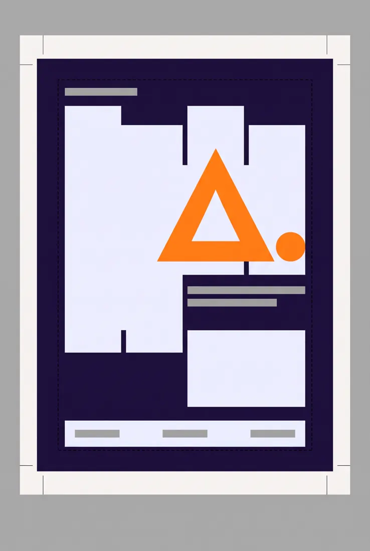
A print-ready event poster layout for [event], portrait 2:3, presented as a pre-press artboard.
Visible pre-press furniture: a 3 mm bleed area extending past the trim edge, crop marks at all four corners, and a dashed safe-area rectangle inset from the trim.
Inside the safe area sits a strong typographic composition: one dominant headline, a secondary date and venue line, and a small sponsor strip at the base.
Bold contemporary poster design in a Swiss-influenced grid, large type contrast, asymmetric balance.
Poster field in [#20113B], headline in [#F2F2FF], one geometric graphic element in [#FF7F11], pre-press marks in thin black.
Constraints: headline under 20 characters, background artwork must run fully into the bleed with no white gaps, no photographic imagery, crop marks must sit outside the trim.
29Rozkładówka magazynu
Do prezentacji kierunku redakcyjnego. Model dobrze rozumie pojęcie gutter, więc warto go użyć wprost.
Wynik tego promptu, model Nano Banana Pro
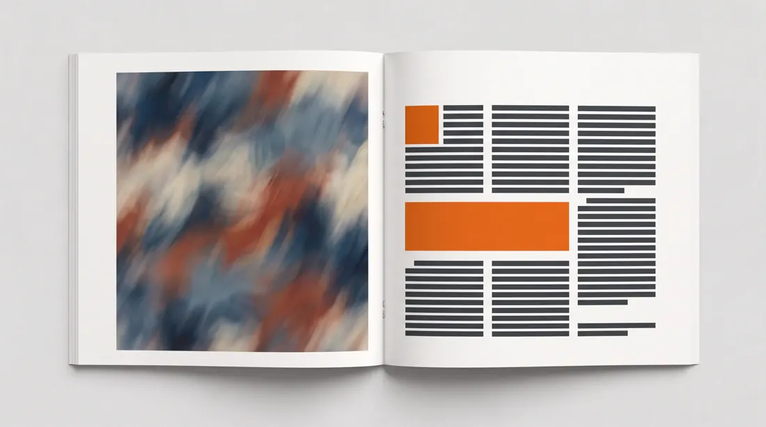
A magazine feature spread about [topic], landscape 16:9 representing two facing pages with a visible centre gutter.
The left page is dominated by a full-bleed image area. The right page carries the editorial layout: a large drop cap opening the body, three text columns, one pull quote breaking across two of them, and a small caption block in the outer margin.
Sophisticated editorial design with a strict baseline grid and confident use of white space.
Paper in [#F5F6F8], body type in [#31343A], the pull quote and drop cap in [#F06206].
Constraints: body copy rendered as realistic greeked text lines rather than readable words, columns must align to a shared baseline, no page numbers, gutter must be clearly visible.
30Plan sesji zdjęciowej
Wysyłasz to fotografowi zamiast opisywać wszystko mailem. Oszczędza godzinę rozmowy i jedną rundę poprawek.
Wynik tego promptu, model Nano Banana Pro
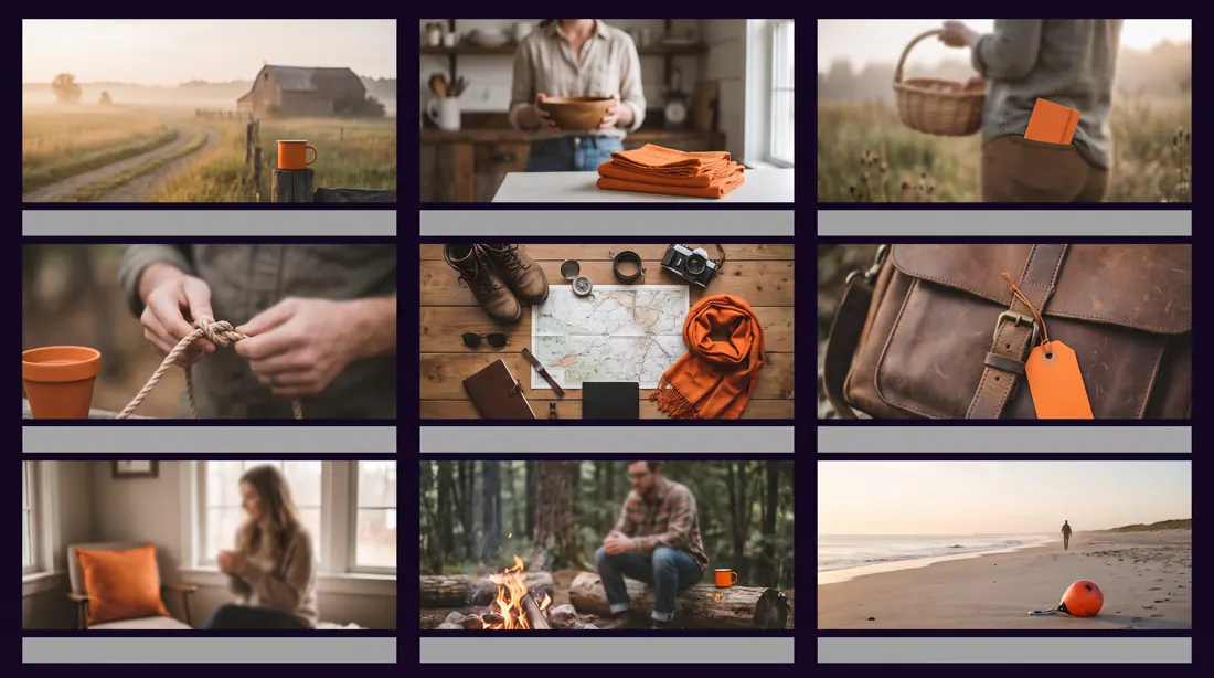
A photography shot list board for a [shoot type] session, landscape 16:9, arranged as a 3x3 grid of reference tiles with a thin label strip under each.
The nine tiles cover a deliberate range: two wide establishing frames, three mid shots, two detail close-ups, one overhead flat lay, and one environmental portrait. Together they must feel like one coherent visual direction, not nine unrelated images.
Each label strip states the shot type and a suggested focal length.
Consistent photographic treatment across all nine: same colour grade, same contrast curve, same light direction.
Muted natural grade with a warm bias, one recurring accent object in [#FF7F11] appearing in at least four tiles to tie the set together.
Constraints: identical tile sizes, no faces in sharp focus, labels under 20 characters, no watermarks, consistent lighting direction across every tile.
Co potrafi model, gdy przestaniesz opisywać wygląd?
Znacznie więcej, niż sugeruje pierwsza trzydziestka. Model nie rozumie słowa "ładny", ale zna knolling, wie co robi obiektyw makro przy przysłonie f/4 i potrafi odtworzyć błąd pasowania w risografie. Poniżej dziesięć promptów opartych na nazwach technik zamiast na przymiotnikach, każdy z wygenerowanym przykładem.
Różnica jest jedna i cała robota siedzi właśnie w niej. Te prompty nie opisują, jak obraz ma wyglądać. Opisują proces fizyczny, którym powstał: jaki obiektyw, pod jakim kątem światło, jaka technika druku, jaka wada procesu.
Dźwignia
Zamiast
Napisz
Nazwa techniki
poukładane przedmioty
forensic knolling layout
Sprzęt
ostre zdjęcie
Hasselblad X2D, 120mm macro, f/11
Fizyka światła
ładnie oświetlone
raking light at a 15-degree grazing angle
Wada procesu
z charakterem
registration offset 2mm, roller streaking
Ostatni wiersz jest najciekawszy i najrzadziej używany. Wady druku, skanowania i optyki to najmocniejszy sygnał autentyczności, jaki możesz podać. Chmura punktów bez dziur wygląda na render. Risograf bez rozjazdu wygląda na plik z drukarki laserowej. Obraz bez wad wygląda na wygenerowany, bo jest.
Dziesięć technik, dziesięć dowodów
poziom zaawansowany
Podmieniasz temat, nie technikę. Knolling zegarka zadziała tak samo na zawartości plecaka albo komponentach produktu. To, co zostaje bez zmian, czyli sprzęt, światło i wady procesu, odpowiada za jakość.
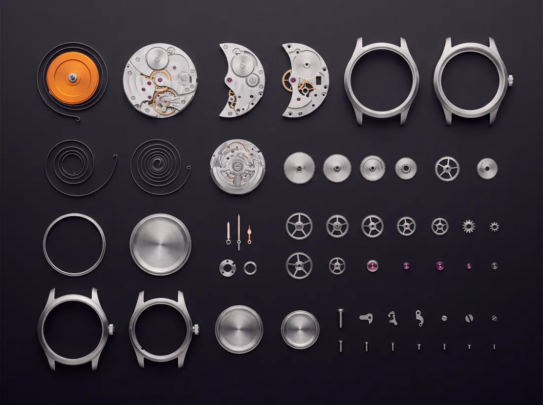
01Knolling
Pokazanie, z czego składa się produkt albo usługa. Działa na stronie ofertowej i w raporcie.
Wynik tego promptu, model Nano Banana Pro
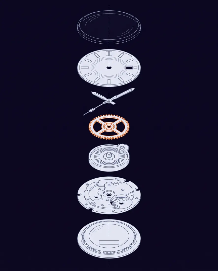
A forensic knolling layout of a fully disassembled mechanical wristwatch, photographed perfectly top-down at exactly 90 degrees with zero perspective distortion.
Every single component is separated and arranged on an invisible grid, aligned to shared horizontal and vertical axes, ordered by size from largest at the top-left to smallest at the bottom-right. Uniform gaps of identical width between all items. Nothing overlaps, nothing is rotated off-axis.
Shot on a Hasselblad X2D with a 120mm macro lens at f/11, a single large softbox directly overhead producing even illumination and almost no shadow. Matte charcoal seamless surface in #0B0617.
The mainspring barrel is anodised #FF7F11 while every other part stays raw brushed steel, so the eye lands in one place.
Editorial style of a Wired magazine teardown feature. CRITICAL: no text, no letterforms, no numbers, no logos, no watermarks anywhere. Any glyph-like shape is a failure.
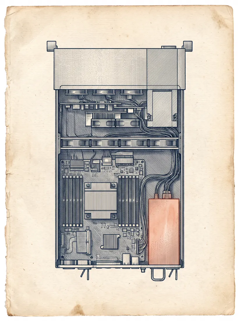
02Rycina miedziorytnicza
Okładka raportu albo tekst techniczny, gdzie zderzenie epok robi robotę.
Wynik tego promptu, model Nano Banana Pro
A cutaway cross-section of a modern rack-mounted server, rendered entirely as a 19th-century copperplate engraving.
Fine parallel hatching and stipple shading only. No solid fills, no gradients, no digital shading of any kind: depth is conveyed purely by line density, exactly as in a Vesalius anatomical plate. The cut plane runs dead vertical through the centre of the machine, exposing internal structure with the reverence usually reserved for a dissected body.
Each internal component is individually hatched at a different angle so the layers separate optically.
Printed on aged ivory laid paper #F2F2FF with visible fibre, ink in deep #20113B. One single component is hand-tinted in #F06206, as if coloured decades after printing.
Plate style of Diderot's Encyclopédie. CRITICAL: no text, no letterforms, no numbers, no logos, no watermarks anywhere. Any glyph-like shape is a failure.
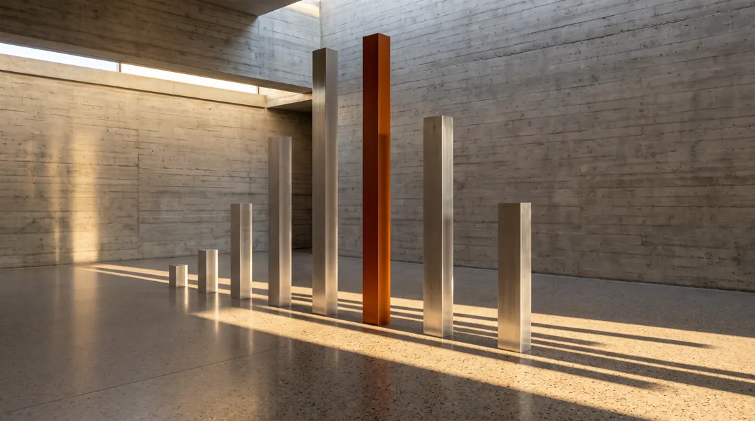
03Fizykalizacja danych
Wykres, który nie wygląda jak wykres. Do raportu rocznego i prezentacji wyników.
Wynik tego promptu, model Nano Banana Pro
A physical data sculpture standing in a raw board-formed concrete gallery space.
Seven vertical columns machined from solid brushed aluminium, each square in section, heights varying substantially from short to very tall, spaced at exact equal intervals on a polished terrazzo floor. The column heights encode a dataset.
Raking late-afternoon sunlight enters from a high clerestory window at a low angle, casting long hard-edged shadows across the floor. The shadows themselves form a second reading of the same data, stretched and skewed.
The tallest column is anodised #FF7F11; every other column stays raw unfinished metal.
Shot on a Phase One with a 50mm tilt-shift lens, verticals perfectly corrected, no converging lines. Architectural photography for Domus magazine. CRITICAL: no text, no letterforms, no numbers, no logos, no watermarks anywhere. Any glyph-like shape is a failure.
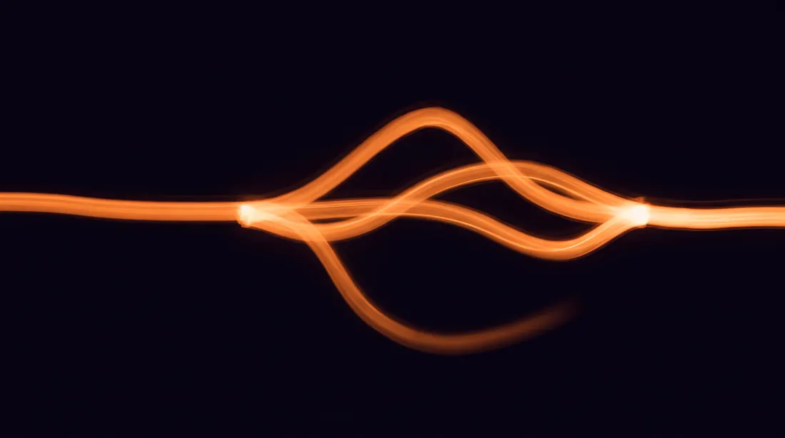
04Długa ekspozycja
Wizualizacja przepływu: ścieżki użytkownika, procesu, danych. Zero ikonek i strzałek.
Wynik tego promptu, model Nano Banana Pro
A 30-second long-exposure photograph shot from a fixed position looking straight down onto a dark studio floor.
Points of light were moved through the space during the exposure, leaving continuous smooth trails that map a branching process: one trail enters from the left edge, travels inward, splits into four at a central node, three of the four converge again at the right edge, and the fourth fades out midway with a soft falloff.
Trails glow in warm #FF7F11 with natural intensity falloff and slight blooming where they cross. Background is pure #0B0617 with no visible floor texture. No light source is visible anywhere in frame.
Shot on a Sony A7R V at ISO 100, f/16, tripod-locked, no camera movement. CRITICAL: no text, no letterforms, no numbers, no logos, no watermarks anywhere. Any glyph-like shape is a failure.
05Projekcja ortograficzna
Dokumentacja produktu, karta katalogowa, sekcja techniczna na stronie.
Wynik tego promptu, model Nano Banana Pro
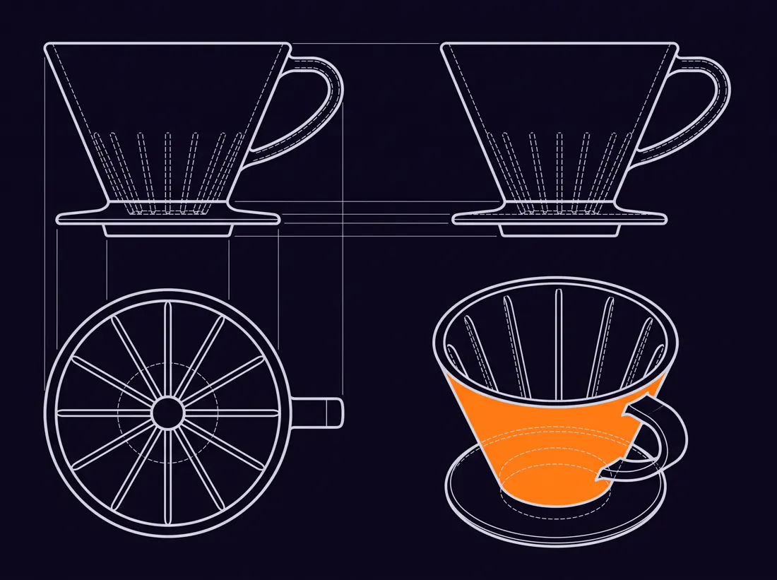
A technical orthographic projection plate of a single ceramic pour-over coffee dripper, laid out as four views on one sheet in strict first-angle projection.
Front elevation top-left, side elevation top-right, plan view from above bottom-left, isometric view bottom-right. All four views share exactly the same scale and sit on shared projection lines, so features align across views.
Exactly two line weights and nothing else: a heavier continuous line for visible edges, a finer dashed line for hidden edges. No shading, no fills, no texture.
Blueprint aesthetic inverted: sheet in #0B0617, all linework in #DDE0E8, and one single surface of the isometric view picked out in #FF7F11.
CRITICAL: no text, no letterforms, no numbers, no logos, no watermarks anywhere. Any glyph-like shape is a failure. No dimension lines, no title block, no border.
06Rozdzielenie kanałów barwnych
Architektura systemu albo warstwy usługi, pokazane bez ani jednego prostokąta z podpisem.
Wynik tego promptu, model Nano Banana Pro
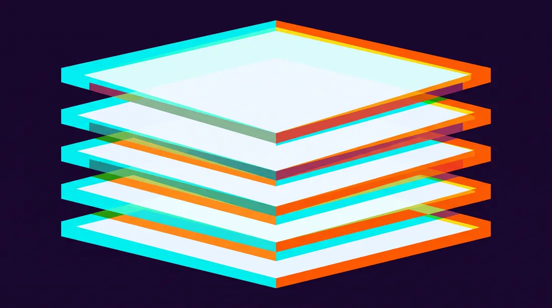
An abstract composition in which a single geometric form has been split into three offset colour channels, as if printed from a misaligned three-strip Technicolor negative.
The form is a stack of five horizontal planes seen at a slight angle from below. The warm channel sits offset noticeably to the right and slightly down; the cool channel offset equally to the left and slightly up; the base layer stays centred. Where all three overlap they blend toward near-white. Where they separate they leave clean hard-edged chromatic fringes.
The misregistration is deliberate and consistent across the whole frame, never random.
Background #150826. Channels tinted #F06206, #C5FEEC and #F5F6F8.
Crisp edges throughout, absolutely no motion blur and no glow. CRITICAL: no text, no letterforms, no numbers, no logos, no watermarks anywhere. Any glyph-like shape is a failure.
07Skok skali
Storytelling od ogółu do szczegółu w jednym kadrze. Mocne otwarcie artykułu.
Wynik tego promptu, model Nano Banana Pro
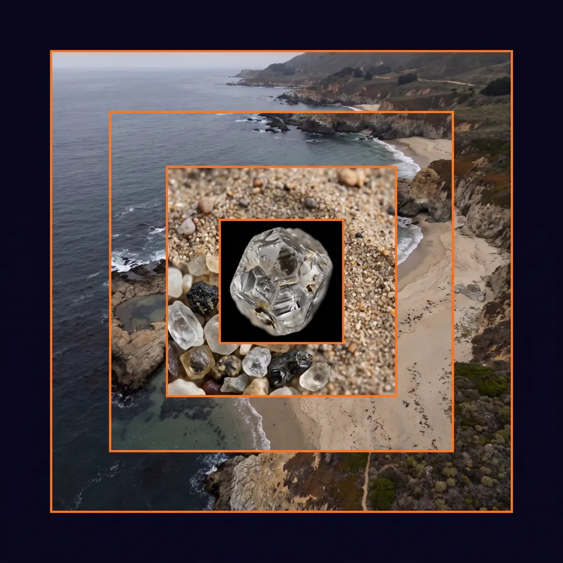
A single square composition showing the same subject at five nested magnifications, arranged as concentric inset frames.
The outermost frame shows a wide aerial view of a coastline. Each inner frame zooms one order of magnitude deeper into the exact optical centre of the previous one: coastline, then beach, then a patch of sand, then individual grains, then the crystalline surface of one grain.
Each frame boundary is marked by a thin #FF7F11 rule. The zoom must be physically plausible and continuous: what reads as flat texture at one level resolves into real structure at the next.
Muted natural palette throughout, sitting on an #0B0617 surround. Even lighting at every scale so the levels read as one system, not five photographs.
CRITICAL: no text, no letterforms, no numbers, no logos, no watermarks anywhere. Any glyph-like shape is a failure. No arrows, no magnifier graphics, no connecting lines between frames.
08Risograf z rozjazdem
Plakat, okładka, materiał na event. Estetyka, której cyfrowy druk nie umie podrobić.
Wynik tego promptu, model Nano Banana Pro
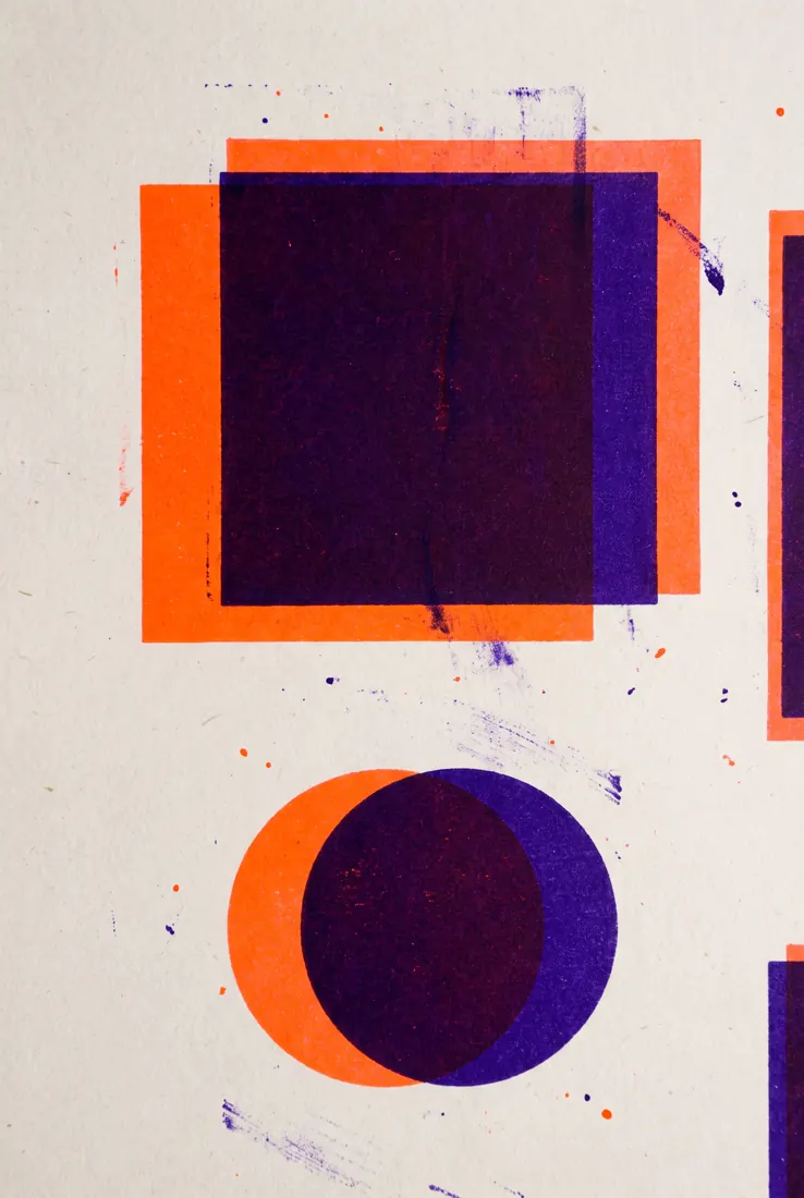
A two-colour risograph print with deliberate registration error.
Only two inks exist in this image: fluorescent orange #FF7F11 and deep violet #20113B, printed on uncoated off-white #F2F2FF stock with clearly visible paper tooth.
The violet layer is offset a couple of millimetres right and slightly down from the orange layer. Where the two inks overlap they multiply into a dense near-black; where they separate, clean single-ink zones appear at every edge.
Authentic press artefacts throughout: visible ink roller streaking in the large solid areas, slight ghosting below dense shapes, uneven coverage, tiny specks of misplaced ink.
Bold geometric composition built from heavy simple shapes. No fine detail, no thin lines, nothing that a risograph could not physically hold. CRITICAL: no text, no letterforms, no numbers, no logos, no watermarks anywhere. Any glyph-like shape is a failure.
09Chmura punktów z fotogrametrii
Digital twin, przestrzeń, temat technologiczny. Wygląda jak zrzut z prawdziwego skanu.
Wynik tego promptu, model Nano Banana Pro
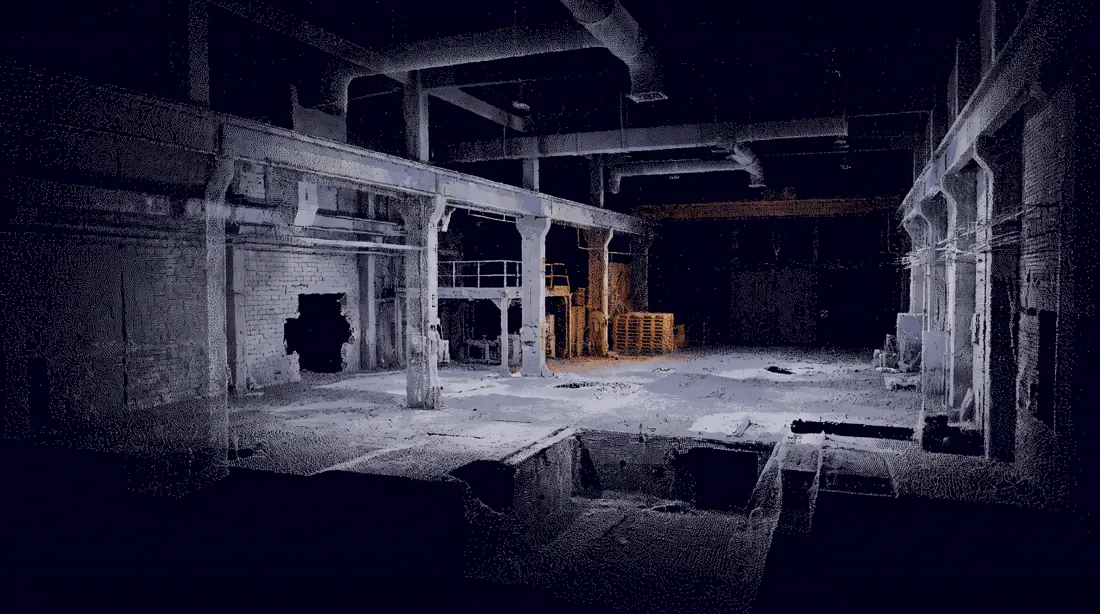
A photogrammetric point cloud reconstruction of an empty industrial interior, rendered as discrete unconnected points floating in absolute void.
Point density varies exactly as it would in a real capture: dense and coherent on surfaces that faced the scanner directly, sparse and noisy where surfaces sat at grazing angles, and completely absent in occluded areas, leaving honest visible holes in the geometry.
Individual points are tiny, one to two pixels, never merging into solid surfaces. Structural edges and corners read clearly because they accumulated more samples; soft and distant surfaces dissolve into scattered noise.
Points carry desaturated colour sampled from source photography: mostly #DDE0E8 and #9B9DB9, with one region of the space accumulating in #FF7F11.
Background pure #0B0617. CRITICAL: no text, no letterforms, no numbers, no logos, no watermarks anywhere. Any glyph-like shape is a failure. No wireframe, no mesh, no connecting lines between points.
10Makro 5:1
Tło hero, tekstura, abstrakcja pod nagłówek. Nie do rozpoznania, więc nie zestarzeje się.
Wynik tego promptu, model Nano Banana Pro
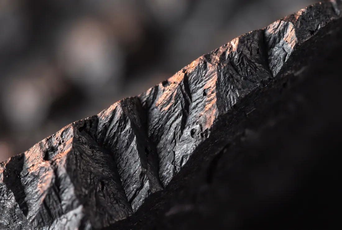
An extreme macro photograph at 5 to 1 magnification, so close that the subject becomes entirely unrecognisable and reads as pure abstract topography.
The subject is the fractured edge of a graphite block. Razor-thin depth of field: one single sharp band runs diagonally across the frame from lower-left to upper-right, and everything falls away into smooth creamy bokeh within millimetres on both sides.
Raking light from the left at a very low grazing angle reveals every ridge, pit and fracture plane as a hard-edged shadow, giving the surface the character of an aerial view of a mountain range.
Shot on a Laowa 25mm ultra-macro at f/4, focus-stacked only within the sharp band.
Natural graphite colour, cool and dark, with a warm #FF7F11 rim highlight where the light catches the highest ridges. CRITICAL: no text, no letterforms, no numbers, no logos, no watermarks anywhere. Any glyph-like shape is a failure.
Jak napisać prompt, którego nie ma na liście?
Wypełnij pięć pól: format, cel, kompozycję, styl i ograniczenia. To ta sama piątka co wyżej, tylko rozpisana na miejsca do uzupełnienia. Trzydzieści promptów nie pokryje każdego przypadku, zawsze będzie trzydziesty pierwszy. Szablon poniżej działa dla każdego z nich, pod warunkiem że nie pominiesz ostatniego pola.
Create a [format] of [subject], [aspect ratio].
Purpose: the image must [explain / compare / sell / teach / present][what exactly] to [audience].
Composition: [grid or layout], [number of elements], reading order [direction], [what dominates the frame].
Style: [named aesthetic], [line weight or rendering], palette limited to [#hex], [#hex], [#hex].
Constraints: no [what you never want], text under [N] characters per label, [the one rule that must not break].
Wypełnij wszystkie pięć pól, nawet jeśli któreś wydaje się oczywiste. Zwłaszcza to ostatnie. Ograniczenia robią więcej niż opis stylu, bo model domyślnie ciągnie w stronę najbardziej przeciętnego wyniku, jaki widział w treningu.
Co najczęściej psuje wynik?
Cztery rzeczy: kolory podane nazwą zamiast hexem, za długi tekst na grafice, zmiana stylu i układu w jednej poprawce oraz brak zakazu perspektywy przy rzutach. Każda odpowiadała za co najmniej jedną nieudaną generację w naszym teście trzydziestu promptów. Naprawa każdej mieści się w jednym zdaniu.
Nazwy kolorów są dla modelu sugestią, nie instrukcją. Pomarańczowy to przedział od żółci po czerwień. Marka ma jeden hex. Wpisz #FF7F11 i powtórz go przy każdym elemencie, który ma go przyjąć. To jedna zmiana, która naprawia najwięcej.
Powyżej dwudziestu pięciu znaków tekst się rozpada. Model nie pisze liter, tylko rysuje kształty, które je przypominają. Krótkie etykiety wychodzą. Zdania nie. Przy polskich ogonkach granica jest jeszcze niżej.
Zmiana stylu i układu naraz to ślepa uliczka. Gdy wynik jest zły, nie wiesz który element go zepsuł. Najpierw dopracuj kompozycję przy neutralnym stylu, dopiero potem dokładaj warstwę wizualną do działającego promptu.
Model domyślnie ucieka w perspektywę. Przy rzutach i planach napisz wprost "strictly overhead view, no perspective". Bez tego dostaniesz ładną wizualizację 3D zamiast planu, którego potrzebujesz.
Jest jeszcze piąta rzecz, ale to już nie pułapka, tylko sposób pracy. Prompt rzadko wychodzi za pierwszym razem i nie ma w tym nic złego. Ustawiasz go, patrzysz co wyszło, poprawiasz jeden składnik, powtarzasz. Ta sama pętla, którą opisywaliśmy przy loop engineeringu i pętlach agentów, tylko krótsza i z obrazkiem na końcu.
Ile waży strona z trzydziestoma wygenerowanymi obrazami?
Bez kompresji 75,7 megabajta, czyli tyle, że strona nie ma prawa się załadować. Surowe wyjście modelu to pliki PNG po półtora do trzech megabajtów każdy. Po konwersji do WebP przy szerokości 1100 pikseli komplet trzydziestu pięciu obrazów zszedł do 1,28 megabajta. To 98,3 procent mniej.
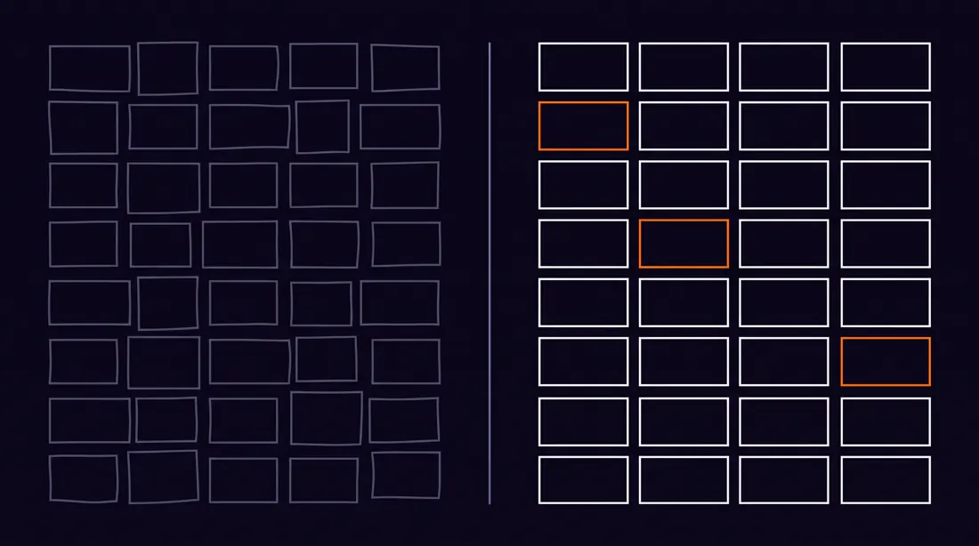
Pomarańczowy pasek w dolnym wierszu to nie błąd rysunku. Tyle właśnie zostaje z 75,7 MB po kompresji. Przy trzydziestu obrazach na stronie to różnica między wpisem, który się otwiera, a takim, który się nie otwiera.
To nie jest kosmetyka. Trzydzieści obrazów po dwa megabajty daje stronę, której nikt nie doczyta, a Core Web Vitals lecą na łeb. Konwersja zajmuje jedną komendę i nie widać jej gołym okiem na ekranie. Jeśli generujesz obrazy do publikacji, potraktuj to jako krok obowiązkowy, nie opcjonalny.
Czy to zastąpi grafika?
Nie, ale zastąpi etap, za który dotąd płaciłeś. Konkretnie ten, na którym zamawiałeś wizualizację pomysłu tylko po to, żeby sprawdzić, czy pomysł ma sens. Finalne pliki, spójny system i przygotowanie do druku dalej robi człowiek. Zmienia się to, co dostaje na wejściu.
Po lewej to, co dostajesz z generatora. Po prawej to, co ktoś potem musi z tego zrobić. Ta różnica ma nazwisko i fakturę.
Praktycznie wygląda to tak: generujesz piętnaście kierunków w godzinę, wybierasz jeden i dopiero ten jeden idzie do grafika. On dostaje konkret zamiast briefu opisanego słowami, a ty nie płacisz za odrzucone koncepcje. Resztę stosu, od logo po materiały marki, zbieramy w przeglądzie narzędzi AI do brandingu.
Nasze dwadzieścia pięć trafień na trzydzieści brzmi dobrze, ale to jedna próba na jednym modelu. Nie traktuj tego jako prawa fizyki. Traktuj jako punkt odniesienia, którego wcześniej nie miałeś, bo nikt go nie policzył.
Tyle. Nie ma tu drugiego dna.
Najczęstsze pytania
Przy prompcie zbudowanym z pięciu składników zwykle jedna. W teście Neurise z sierpnia 2026 na trzydziestu promptach dwadzieścia pięć dało obraz zgodny z briefem za pierwszym razem, co daje 83 procent. Najlepiej wypadły rzuty i makiety UX, trafiając w komplecie. Najsłabiej storyboardy, dwa na cztery.
Model był trenowany głównie na angielskich opisach obrazów, więc po angielsku trafia precyzyjniej w styl, kompozycję i terminy techniczne. Polski działa, ale częściej gubi układ i myli terminy branżowe jak spad czy izometria. Sam tekst wewnątrz grafiki możesz zamawiać po polsku.
Częściowo. Krótkie napisy do około 25 znaków wychodzą zwykle dobrze, ale ogonki przy ą, ę, ś i ż potrafią się gubić lub deformować. Przy grafikach z dużą ilością tekstu bezpieczniej wygenerować tło bez napisów i dołożyć tekst w edytorze.
Praktyczna granica to około 25 znaków na jeden blok tekstu. Powyżej tego model zaczyna gubić litery, dublować wyrazy albo generować znaki, które przypominają litery, ale nimi nie są. Przy infografikach dziel tekst na krótkie etykiety zamiast zdań.
Zgodnie z warunkami OpenAI użytkownik ma prawa do wygenerowanych obrazów i może ich używać komercyjnie. Weryfikuj to jednak przed każdym wdrożeniem, bo warunki się zmieniają, a osobną kwestią jest ryzyko podobieństwa do istniejących znaków towarowych.
Bo najpewniej podajesz je nazwą. Pomarańczowy to dla modelu przedział od żółtego po czerwony. Podawaj wartości hex, na przykład #FF7F11, i powtórz je przy każdym elemencie, który ma ten kolor przyjąć.
Rozdziel te dwie rzeczy. Najpierw wygeneruj z opisem samej kompozycji i neutralnym stylem, aż układ będzie poprawny. Potem dopisz warstwę stylu do działającego promptu. Zmiana obu naraz sprawia, że nie wiesz, który element zepsuł wynik.
Metodologia testu. Trzydzieści promptów w siedmiu kategoriach, model gemini-3-pro-image (Nano Banana Pro), sierpień 2026, jedna generacja na prompt, ta sama paleta w każdym. Za trafienie uznaliśmy obraz zgodny z zadanym układem, liczbą elementów i paletą. Ocena wizualna, jeden oceniający, bez ślepej próby. Trzydzieści to mała próba i jeden model, więc traktuj 83 procent jako punkt odniesienia, nie jako wartość uniwersalną.
Czego tu celowo nie ma. Krążące w sieci liczby typu "76 procent grafików używa AI" albo "150 milionów użytkowników miesięcznie" pominęliśmy, bo po sprawdzeniu nie prowadzą do żadnego badania pierwotnego, tylko do serwisów powtarzających je nawzajem. Liczba Adobe dotyczy twórców publikujących w social mediach, a badanie wprost wykluczyło zawodowych projektantów, więc nie jest to dana o grafikach.
Układ kategorii i lista trzydziestu zastosowań pochodzą z artykułu Promptowego. Wszystkie prompty napisaliśmy od zera po angielsku w strukturze pięcioskładnikowej. Limit około 25 znaków na blok tekstu to obserwacja z naszych testów, nie oficjalna specyfikacja OpenAI. Warunki licencyjne weryfikuj przed każdym wdrożeniem komercyjnym, bo zmieniają się częściej niż dokumentacja.
@miuoshekBuduje systemy AI i automatyzacje w Neurise

 Milo Barczynski (@miuoshek)
11 min czytania
27 lipca 2026
Milo Barczynski (@miuoshek)
11 min czytania
27 lipca 2026